Belgian

About the client
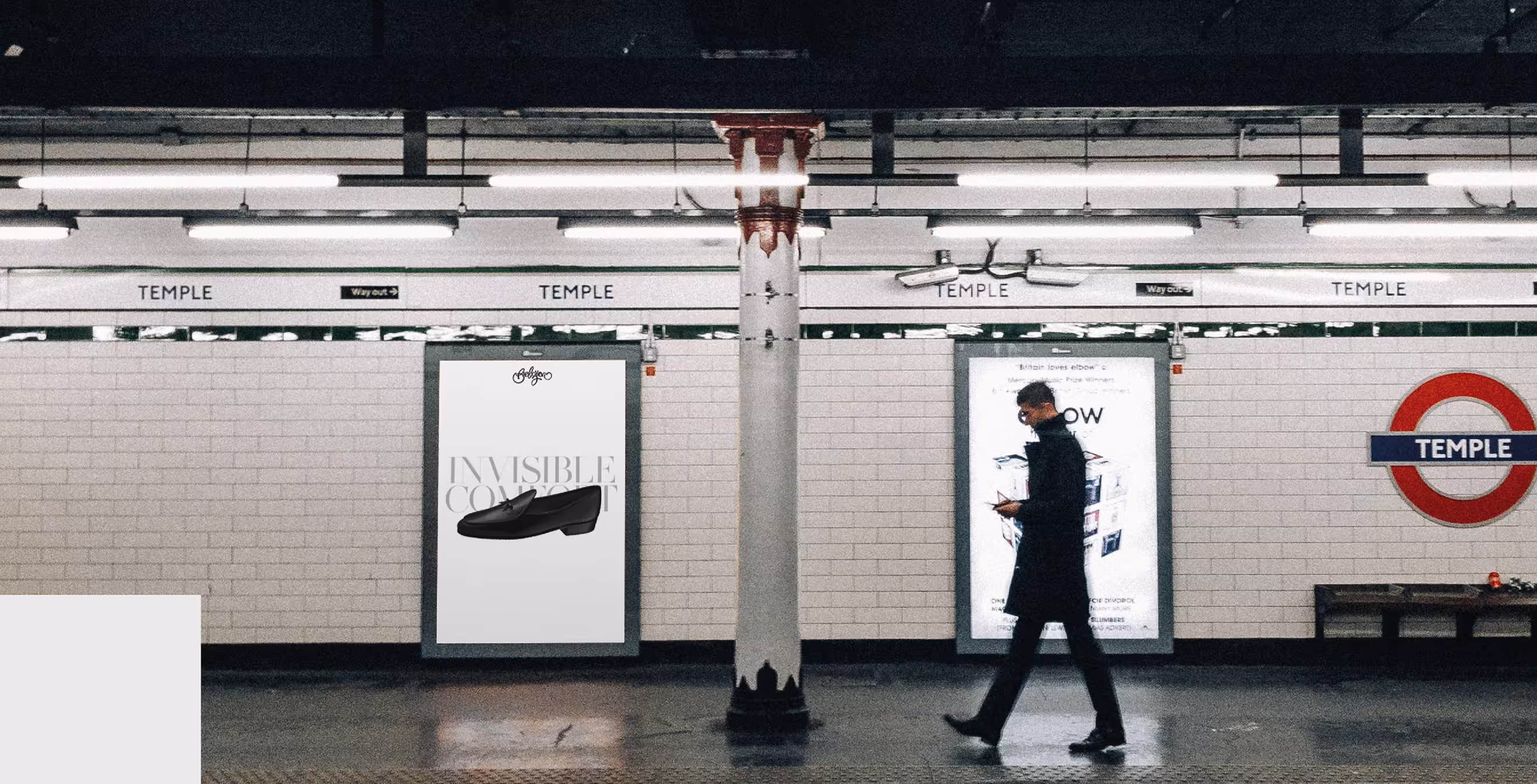
Rebranding for a luxury handmade footwear brand
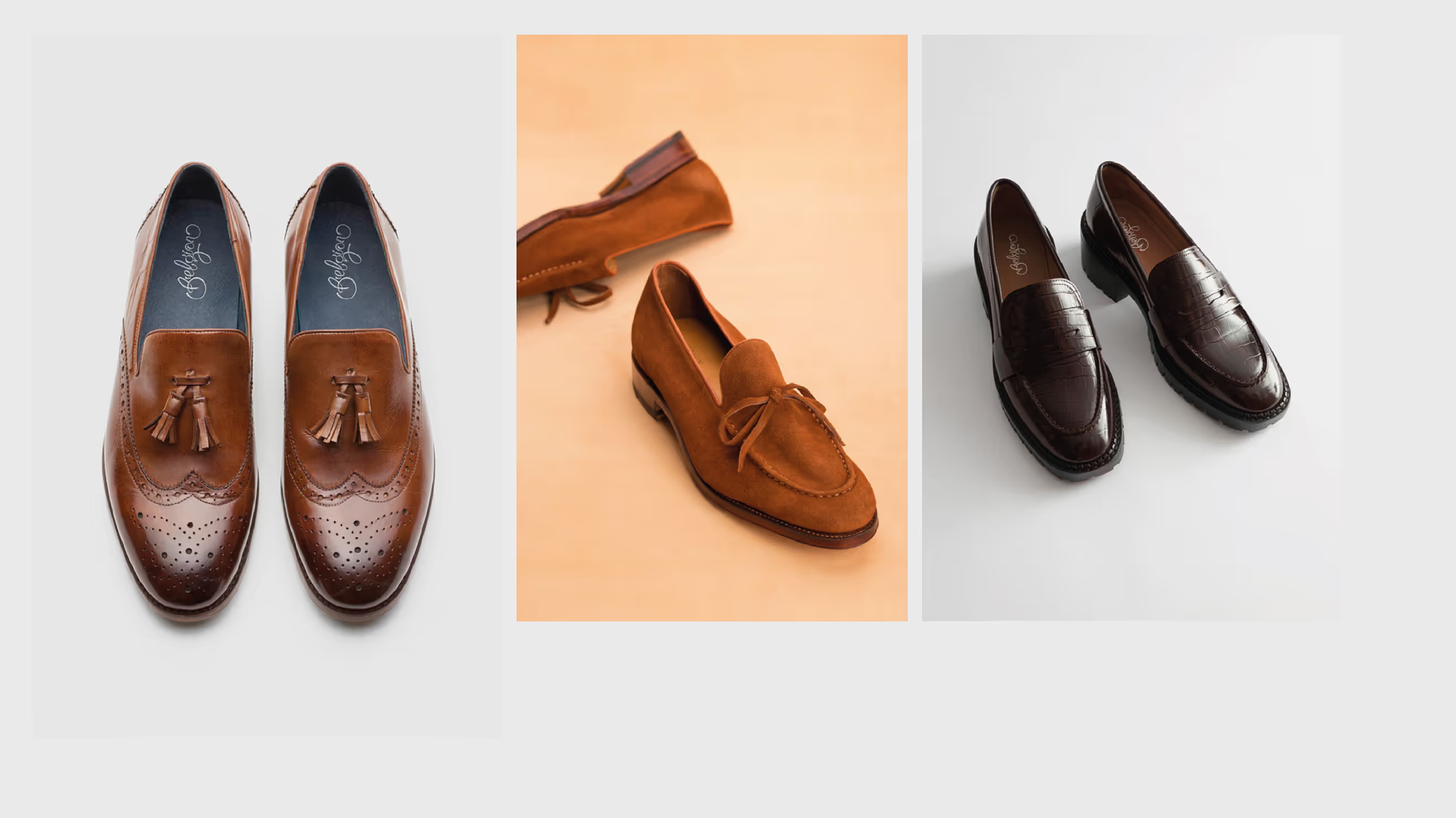
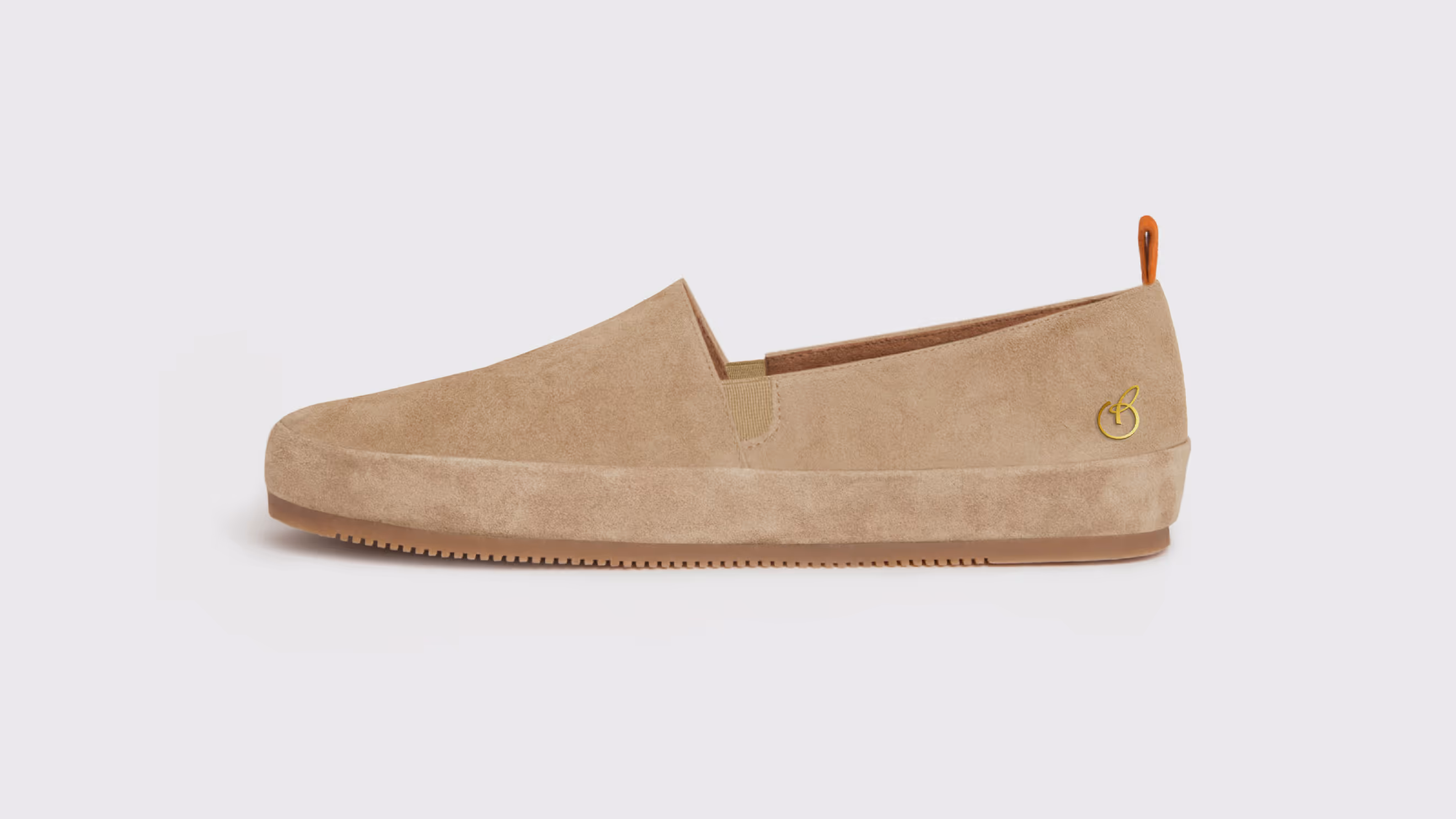
Belgian is a luxury footwear brand that specializes in men's and women's shoes.
Polybox Studio delivered the complete rebrand in 2 weeks — new logo, custom lettering, brand pattern, packaging design, and visual identity system.
- Timeline:2 weeks
- Services:
Problem Statement
We saw two main pain points for the brand: its visual identity appeared outdated, and it needed to attract a wider audience. The brand's visual identity had not kept up with current trends, limiting its appeal to new customers. At the same time, Belgian needed to expand beyond its niche market without losing its luxury status. These issues showed that the brand needed a redesign in order to refresh its look and appeal to more people while still maintaining its high-end image.
Our role
We decided to enhance the Belgian’s brand identity, making it more appealing to a wider audience, while still maintaining its exclusive feel. Our goal was to create a visual story that positions the brand as a premium choice, a symbol of refined taste and subtle elegance.
To achieve this, we redesigned the brand in a way that stands out, not with loud, flashy colors, but by subtly showing that its customers are discerning people who value quality and uniqueness. We aimed to create an image that appeals to those who enjoy the finer things in life and want a brand that reflects their unique style.
— Polybox marketing research
Design Rationale
For us, Belgian is all about underrepresented elegance, and we wanted to show that in our rebrand concept. We did a minimalistic design with lifestyle photos that show the brand's vibe. The logo has these cool, flowing lines that give off sophistication and modernness.
— Kim Mikhailov
Brand designer
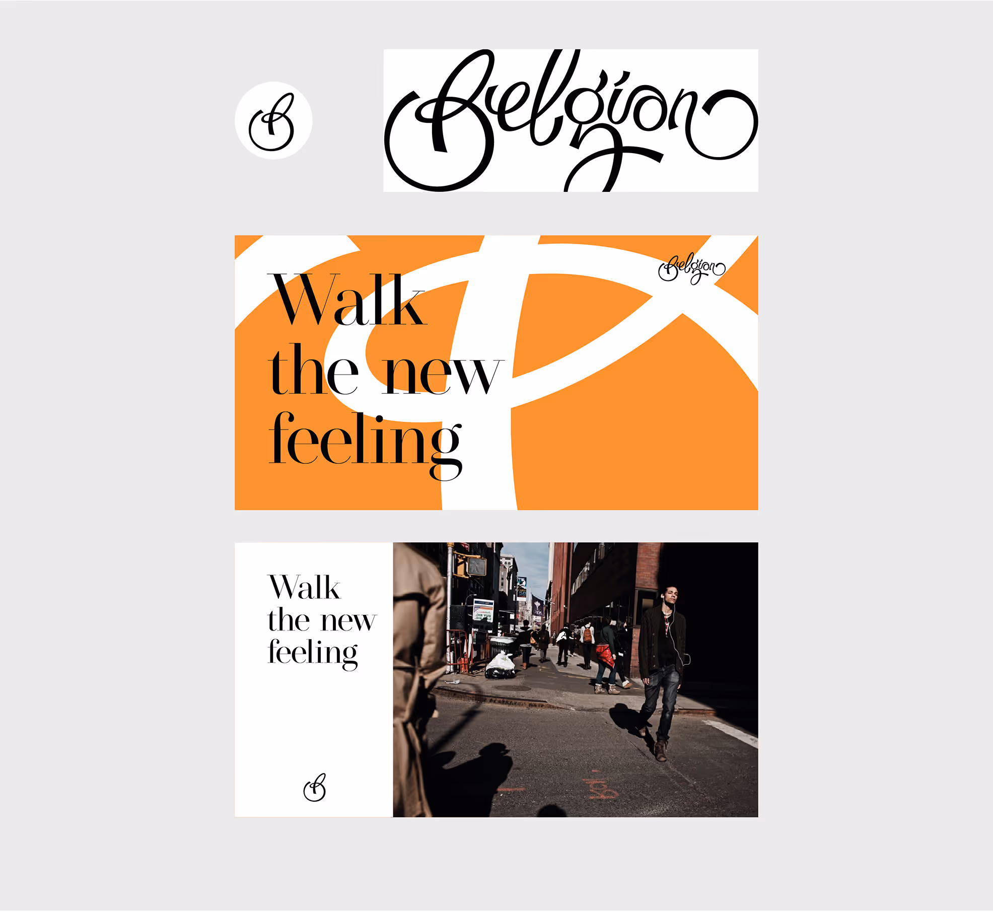
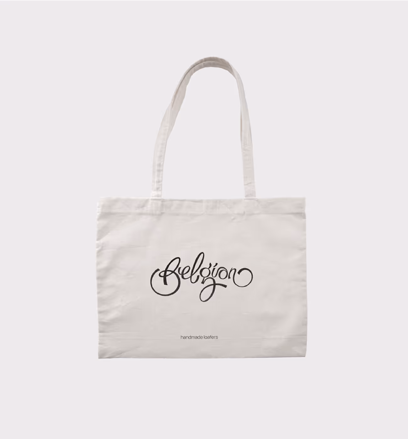
Logo design
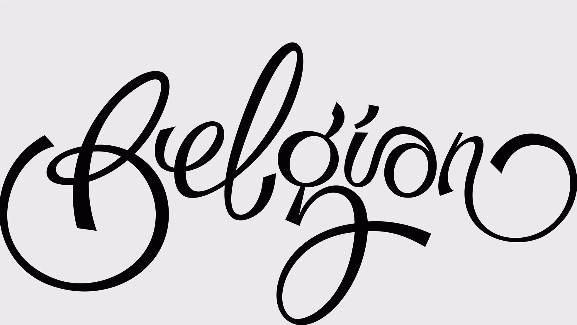
The logo features a custom handwritten font with bold strokes, combining a unique and modern aesthetic with a nod to Belgian's rich history. The handwriting style reflects the brand's long-standing heritage, while the bold strokes introduce a sense of dynamism and energy. Each letter is carefully designed to stand out.
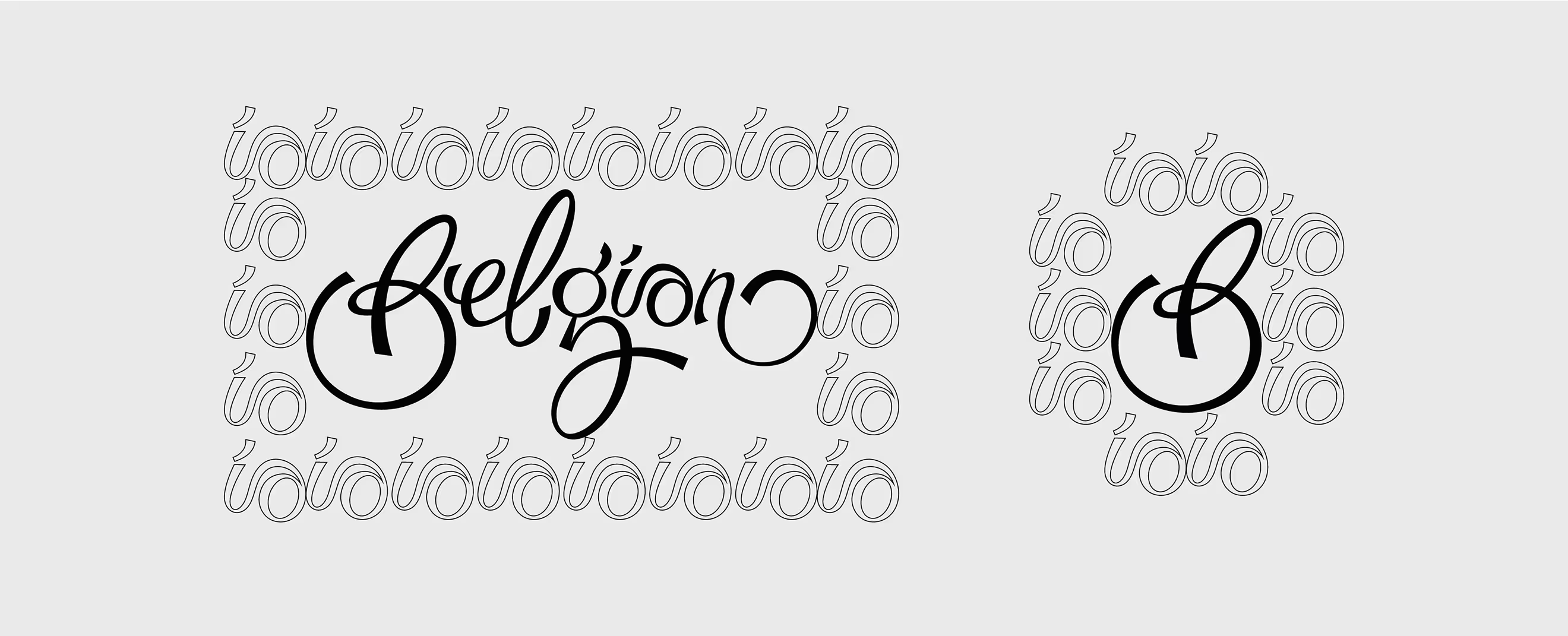
Deconstructing the logo
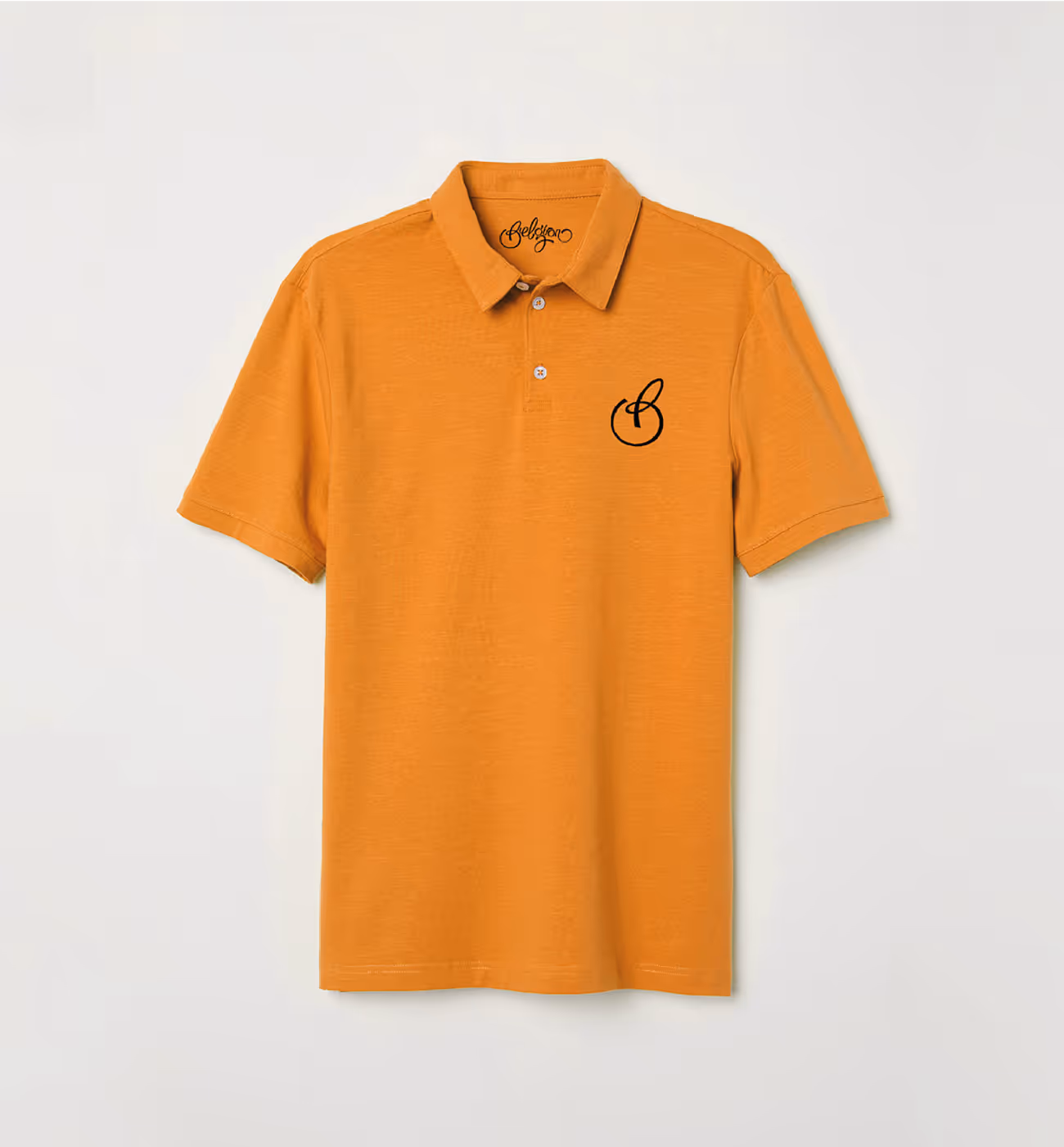
The handwritten logo font allows you to break it up into different parts without losing the overall look. So, each piece and each letter could be used as a brand pattern or part of the background.

Color palette
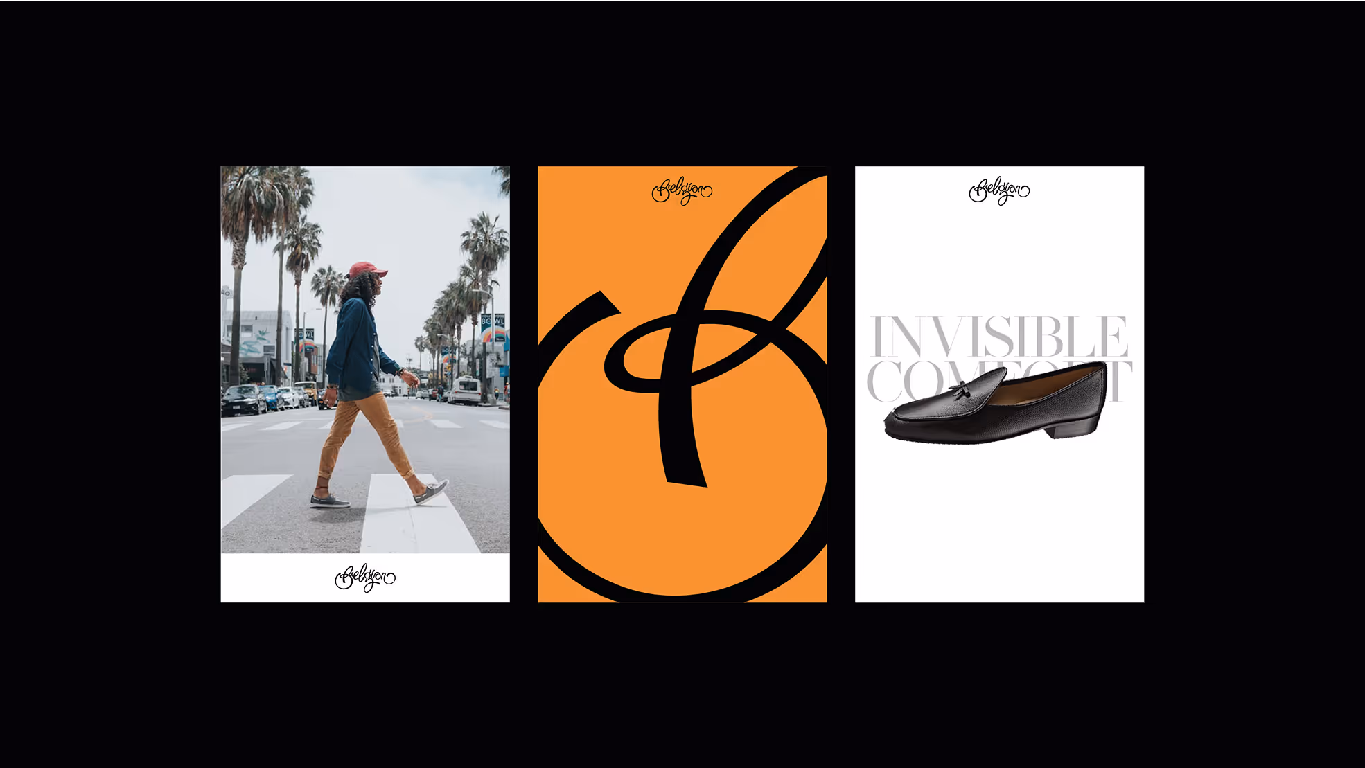

In the brand's color palette, we have selected three main hues: white, black, and a vibrant orange as an accent color. This combination of colors is versatile and timeless, blending neutral shades with a modern touch thanks to the bright and energetic orange. This color scheme is perfect for Belgian, which can be both classic and modern.
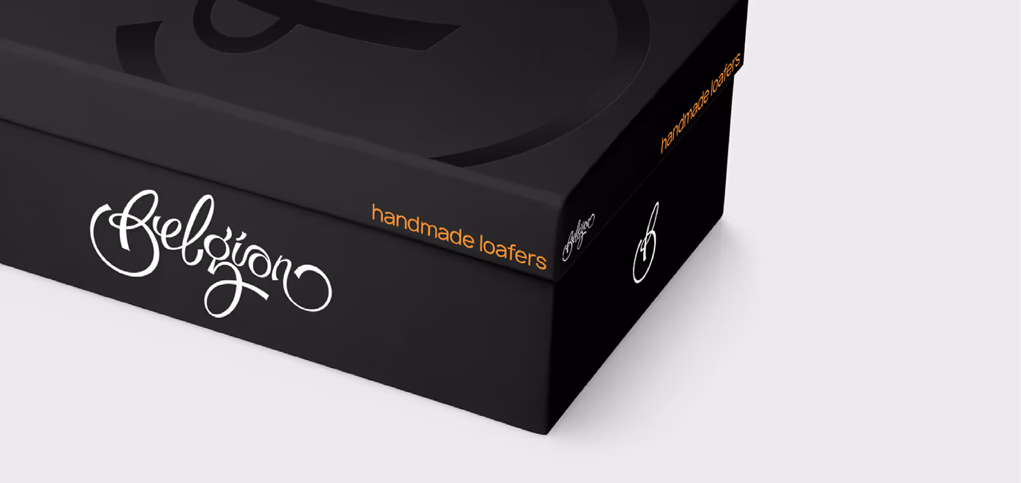
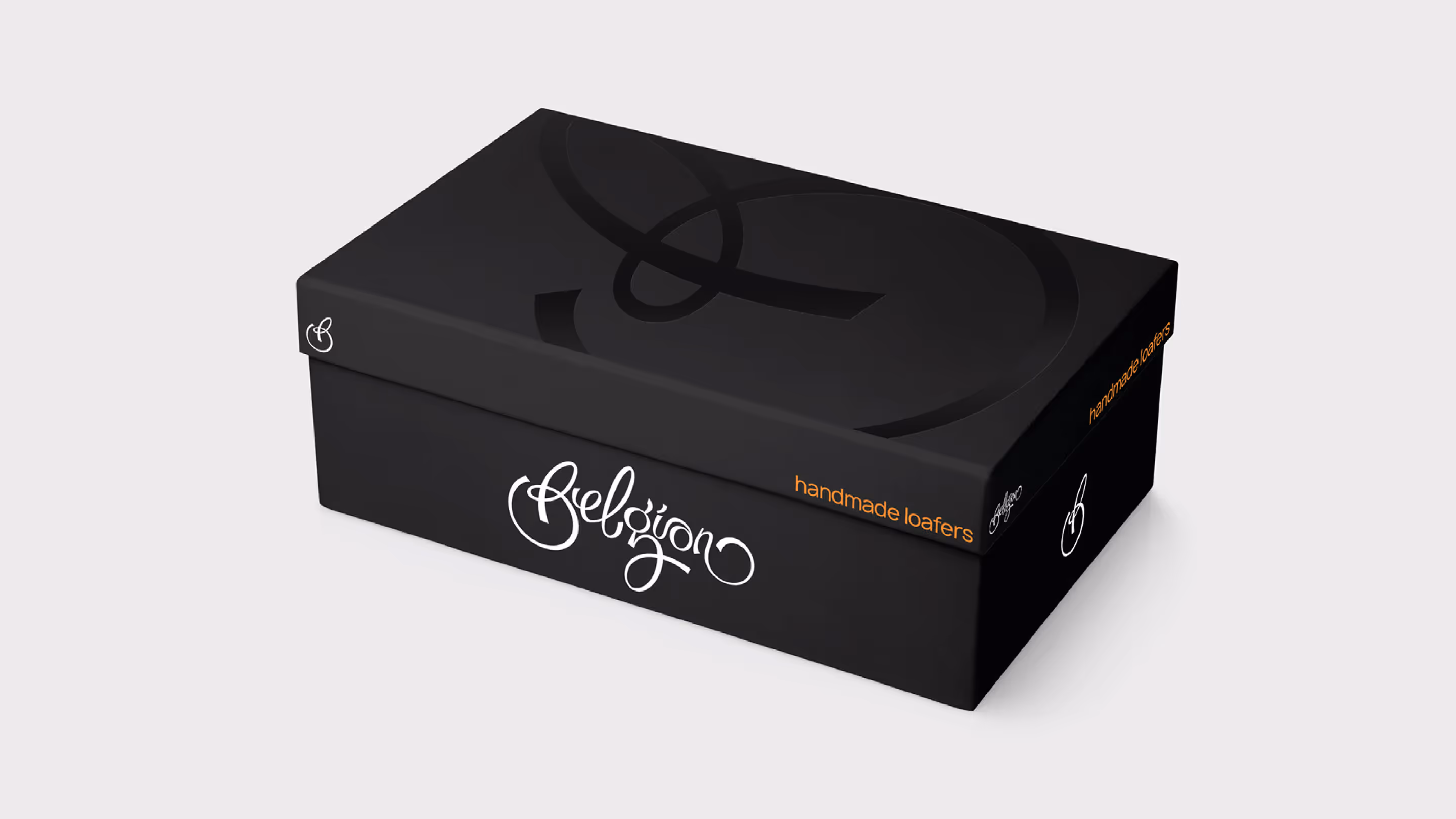
Packaging Design
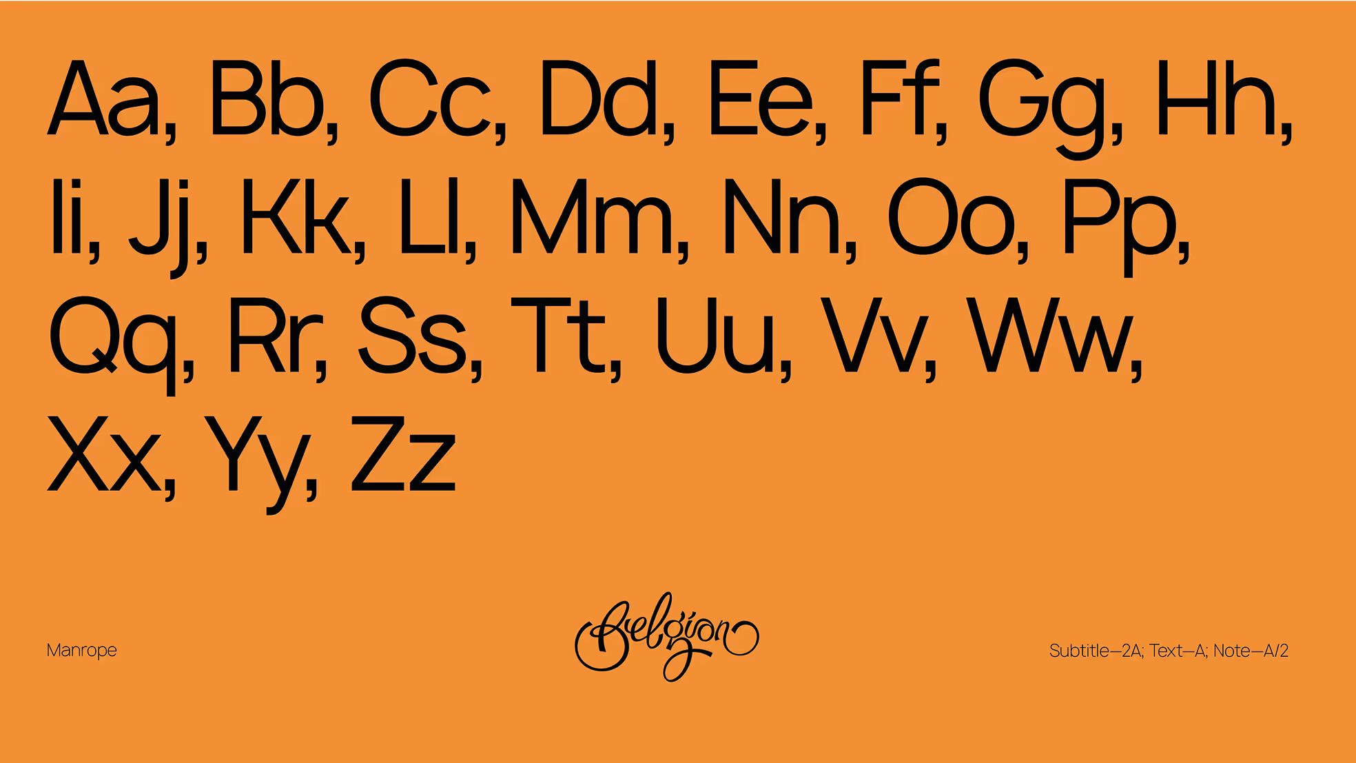
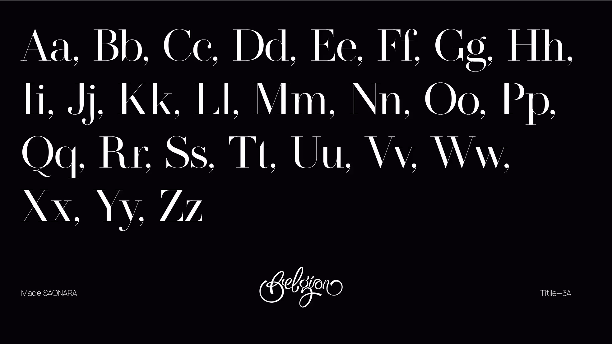
We've chosen two corporate fonts – SAONARA and Manrope. SAONARA has a strong, bold personality and gives a modern, sleek feel. Manrope is versatile and easy to read and is the basis for all the brand advertising materials.
- ManagerValeria Kozlova
- Technical DesignerAleksandra Kalinicheva
- DesignerKim Mikhailov