Botkube

About the client
Full-cycle design development for a Kubernetes ChatOps platform
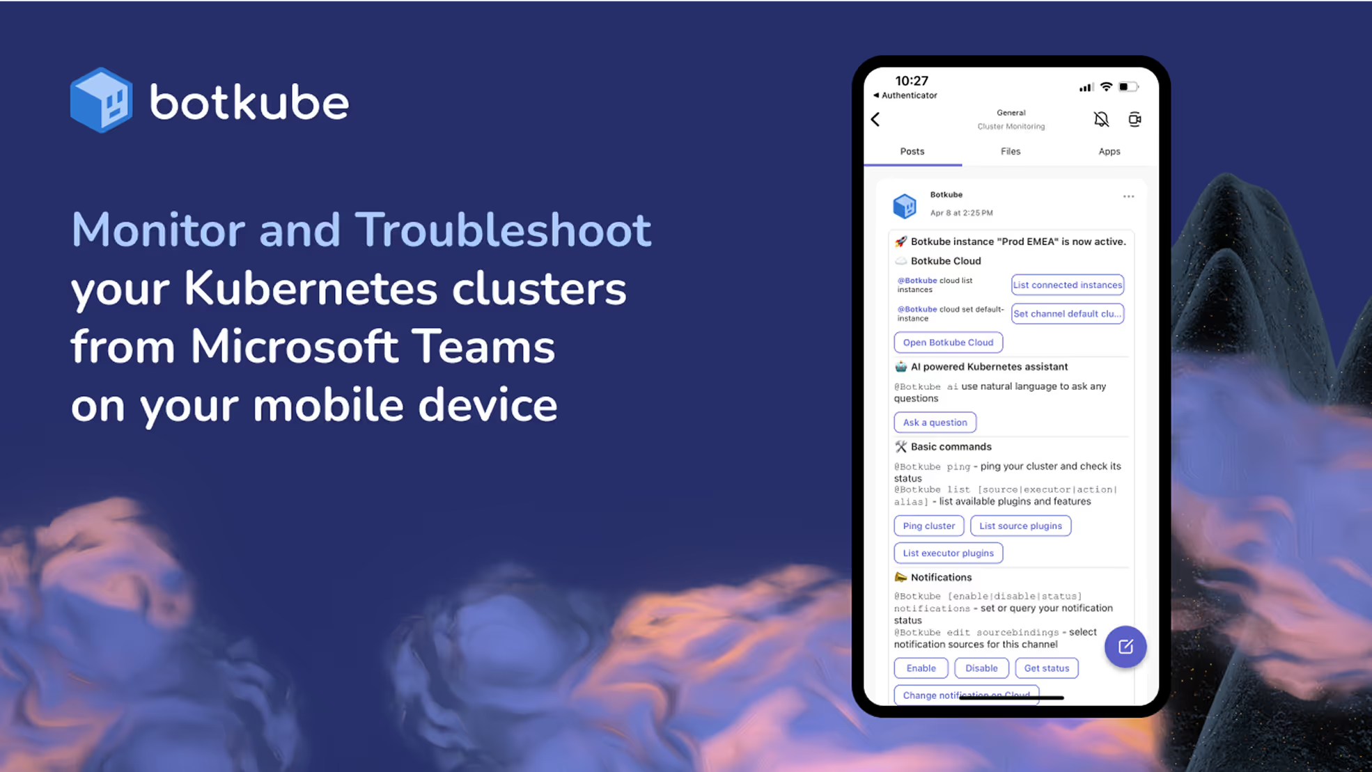
Botkube is a bot-based monitoring and management tool for Kubernetes. It provides DevOps, system administrators, and developers with secure access to clusters directly from their chat and collab platforms.
- Timeline:2 years
- Services:Branding
Web design
UX/UI design
Web development
Illustrations - Website:botkube.io

Problem Statement
Botkube needed a brand identity that stood out in a among other DevOps tools while fitting easily into Kubeshop’s family. The goal was to instantly grab attention. The brand had to reflect open-source agility and real-world experience without looking or sounding like competitors.


Our role
We started with a vision for a visual strategy, combining the Kubeshop and Botkube cores. We tied the main brand to the sub-brands with typography and interface elements. We thought about every little detail to make it pop on the website and in promotional materials.
Next, we focused on what Botkube does best - its open-source roots, Kubernetes integration, and team expertise. We wanted the brand to be relatable but also credible, and to cut through all the DevOps chatter.
Lastly, we built a website and social presence with clean layouts and easy navigation. We made the visuals approachable, not abstract, to encourage people to stop and explore Botkube more. The goal was for it to be fun and memorable.
— Polybox marketing research
Design Rationale
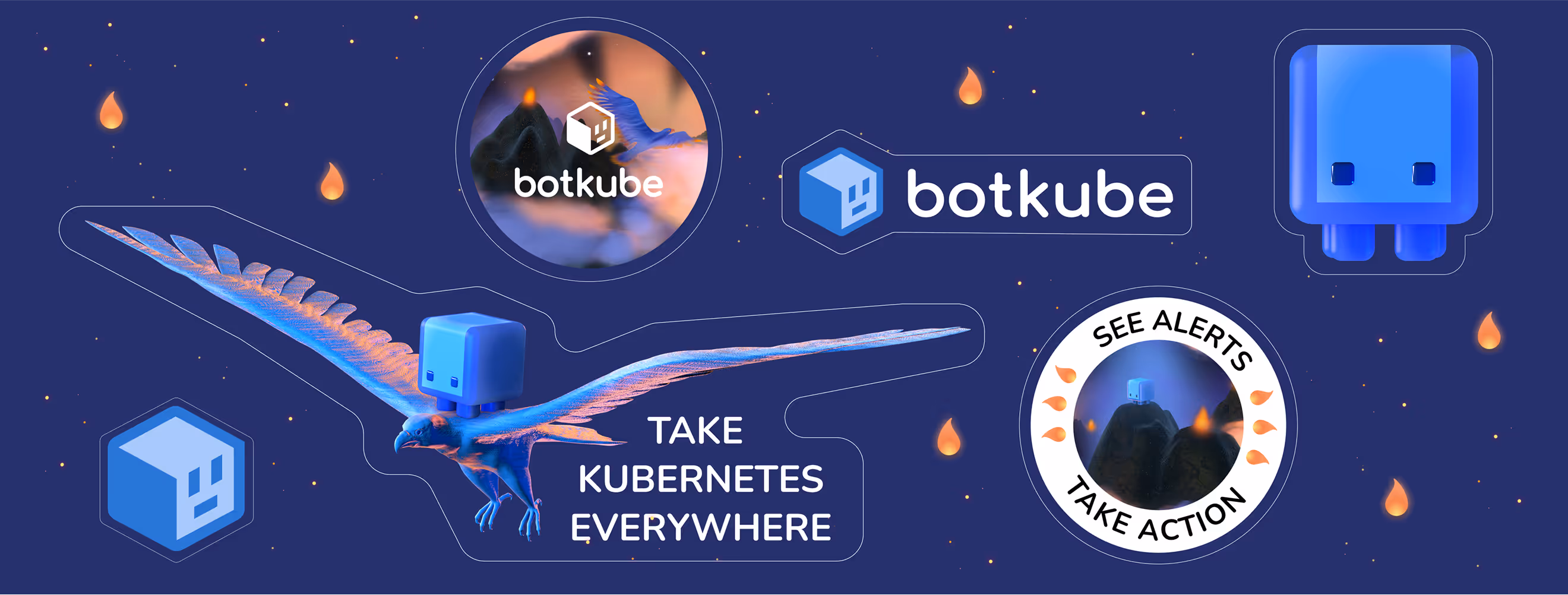
We needed a brand that people could really trust, not just kind of like. So we came up with a mascot who's helpful but not obnoxious, and knows his stuff but doesn't think he's better than everyone else. He's not here just to "give advice", he actually makes complex things easier to understand and helps everyone keep on track.

— Elizaveta Vakhrameeva
Brand designer
Animates details
For Botkube, real-life interaction was a must. We wanted users to understand how the product worked instantly - not just what it did.
So, we built a library of simple animations that were focused and purposeful, without complex graphics, but with clean, functional movement that showed the chatbot responding and solving problems.
.avif)
Logo anatomy
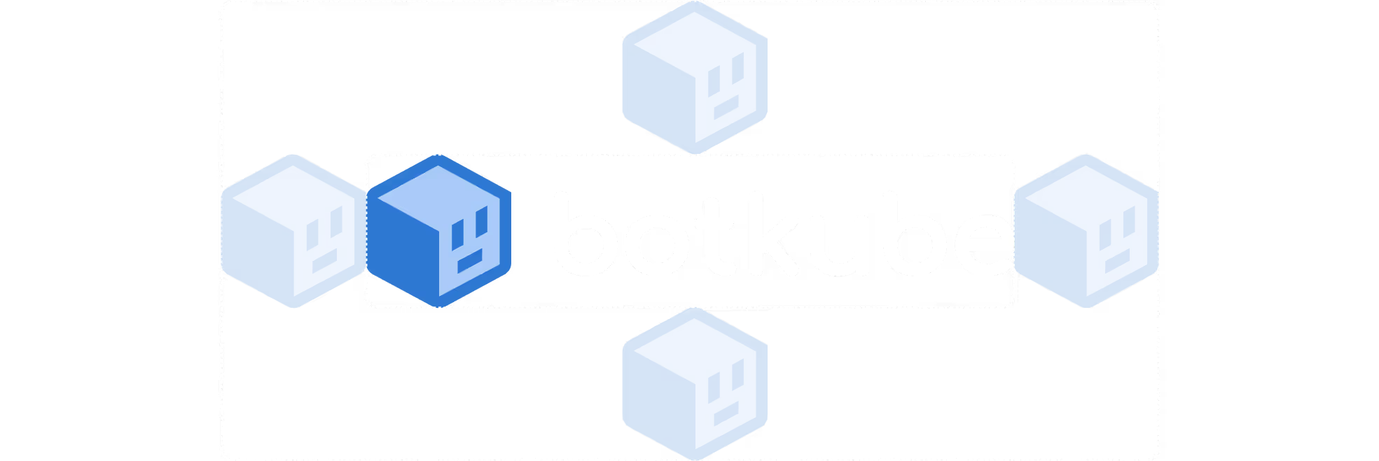
The logo anchors Botkube in Kubeshop's family through shared composition, ensuring instant recognition. But its essence lives in the mark: a cube with a humanized face. This face is built from minimal strokes that whisper "chatbot" without shouting. The cube represents Kubernetes (containers, infrastructure) and the face represents conversation and assistance.
.avif)
The Botkube Design System
%201%20(1).avif)

With Botkube, we have created a dynamic design system using Figma. This was a one-stop-shop for ensuring consistency across all platforms.
The system included a variety of components, such as color schemes, fonts, icons, buttons, forms, menus, pre-designed templates, and layout patterns. Additionally, we provided detailed documentation on how to use all of these assets.
.avif)
- ManagerValeria KozlovaDonata Volkova
- Technical DesignerElizaveta VakhrameevaAleksandra Kalinicheva
- Web DesignersElizaveta VakhrameevaYana KutlushinaSvetlana KalmykovaAlina SultanovaJulia MolochaevaDenis Gurkov
- DesignerElizaveta Vakhrameeva
- 3D DesignerElizaveta Vakhrameeva