Foodiee
.avif)
About the client
Embodying nostalgia in a food startup's brand identity
FOODIEE is a Washington-based startup that serves up delicious comfort food in a variety of flavors at reasonable prices and with fast delivery.
- Timeline:2 weeks
- Services:Branding
- Website:getfoodiee.com
Problem Statement
%201.avif)
For FOODIEE, it was important to find a voice and a face that could be seen and heard in the crowded market of Washington DC. Their competitors were not just other restaurants in the area, but also big platforms like DoorDash and Uber Eats.
They needed to translate their main advantage: delicious food at reasonable prices with fast delivery, and find the key not to the city, but to the hearts of local foodies.

Our role
Firstly, we had to come up with a unique visual identity for FOODIEE that would stand out from the competition. We knew it was important to make a distinct difference from other restaurants, because there's a lot of competition in the industry and businesses often struggle to attract customers. But at the same time, there's also a huge market potential with an annual growth rate predicted to be 11.8% by Market Research Future until 2032.
Secondly, we decided to incorporate gamification into FOODIEE's interactions with customers. That way, they could compete with bigger platforms' rewards systems and attract people to FOODIEE app. We also wanted to gain recognition from target audience — millennials and food enthusiasts.
— Polybox marketing research
%201.avif)

Logo anatomy
%201.avif)
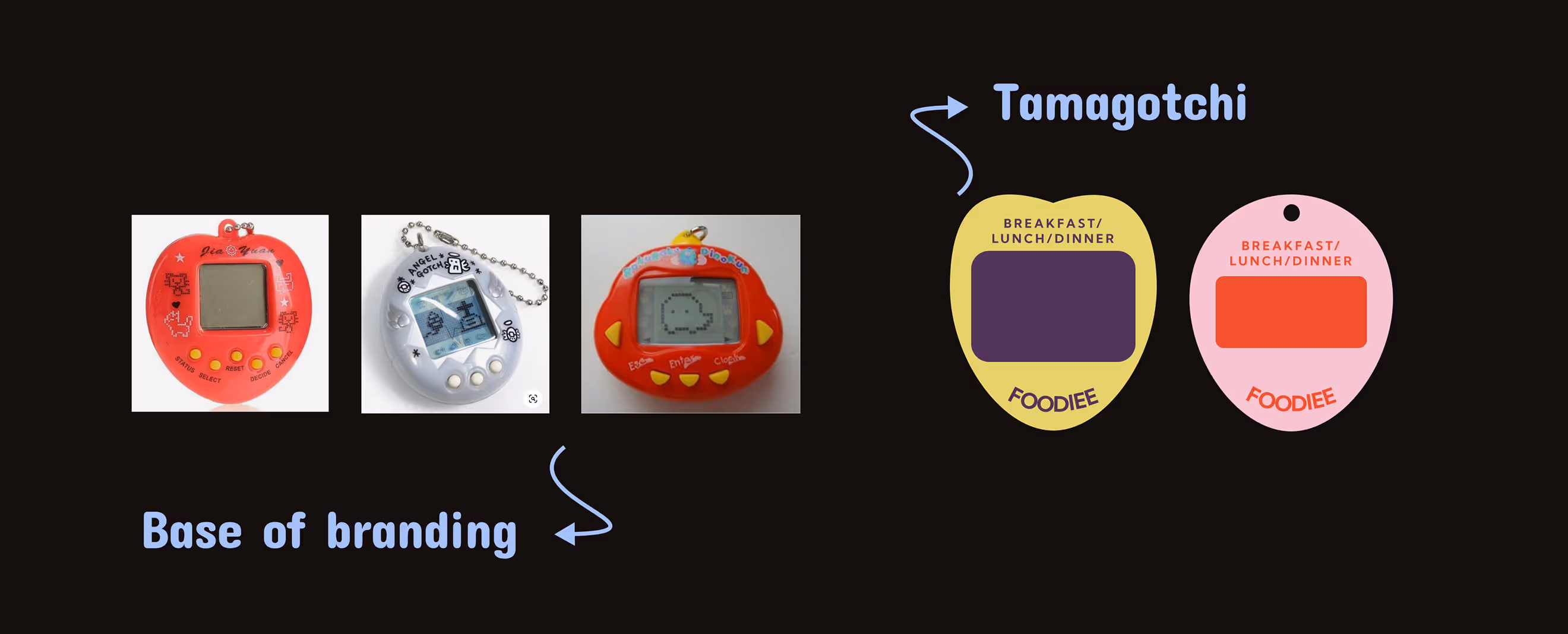
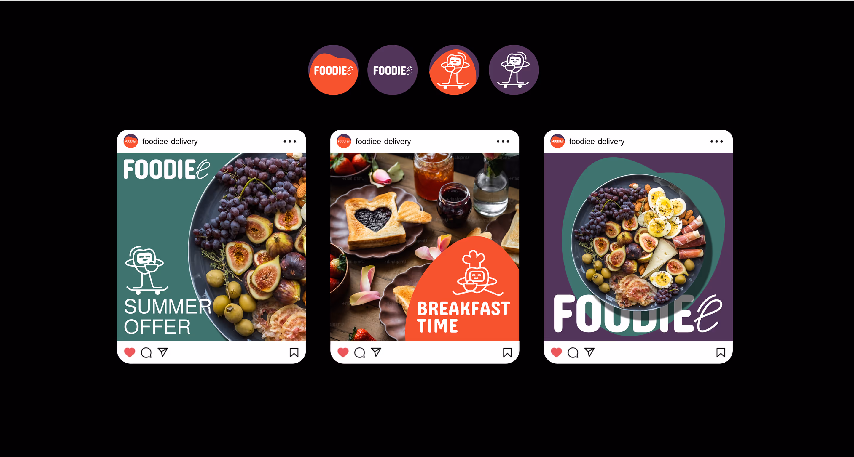
For the logo, we used Concert One font. We complemented its softness and roundness with a thinner handwritten "E" at the end. With the logo, we also used a distinctive mascot inspired by Tamagotchi. The system allows the character to be used in different poses while staying consistent and on-brand. This gives the logo flexibility and playfulness.
Design Rationale
We got the idea from Tamagotchi, those little digital pets that you have to take care of. What if we made a game or app where you could grow a character and watch it evolve and change with time, based on orders or special offers? That would totally bring back some nostalgia for people.

— Elizaveta Vakhrameeva
Brand designer
Mascot choices
%201.avif)
Color palette
%201.avif)

In the color palette, coral red, deep purple and teal are combined with pastel secondary colors, referencing 90s tech aesthetics and contemporary food photography. This color palette strategically uses a wide range of colors to differentiate between meal types and navigation elements. It also provides flexibility for seasonal campaigns and menu variations while maintaining the brand's identity.
Brand typography
%201%20(1).avif)
For FOODIEE, we went with Concert One for the accent font and Almarai for the base one. It's a great combination — it's memorable and easy to read, and it reflects the brand's balance between creativity and user-friendliness.
.avif)
- ManagerValeria Kozlova
- Technical DesignerElizaveta Vakhrameeva
- DesignerElizaveta Vakhrameeva