Kubeshop

About the client
Scalable open-source identity for Kubernetes accelerator
Kubeshop is an open-source accelerator that builds and supports tools for developers and testers in the Kubernetes and cloud-native space.
- Timeline:ongoing
- Services:BrandingWeb designUX/UI designWeb developmentIllustrations
- Website:kubeshop.io
Problem Statement

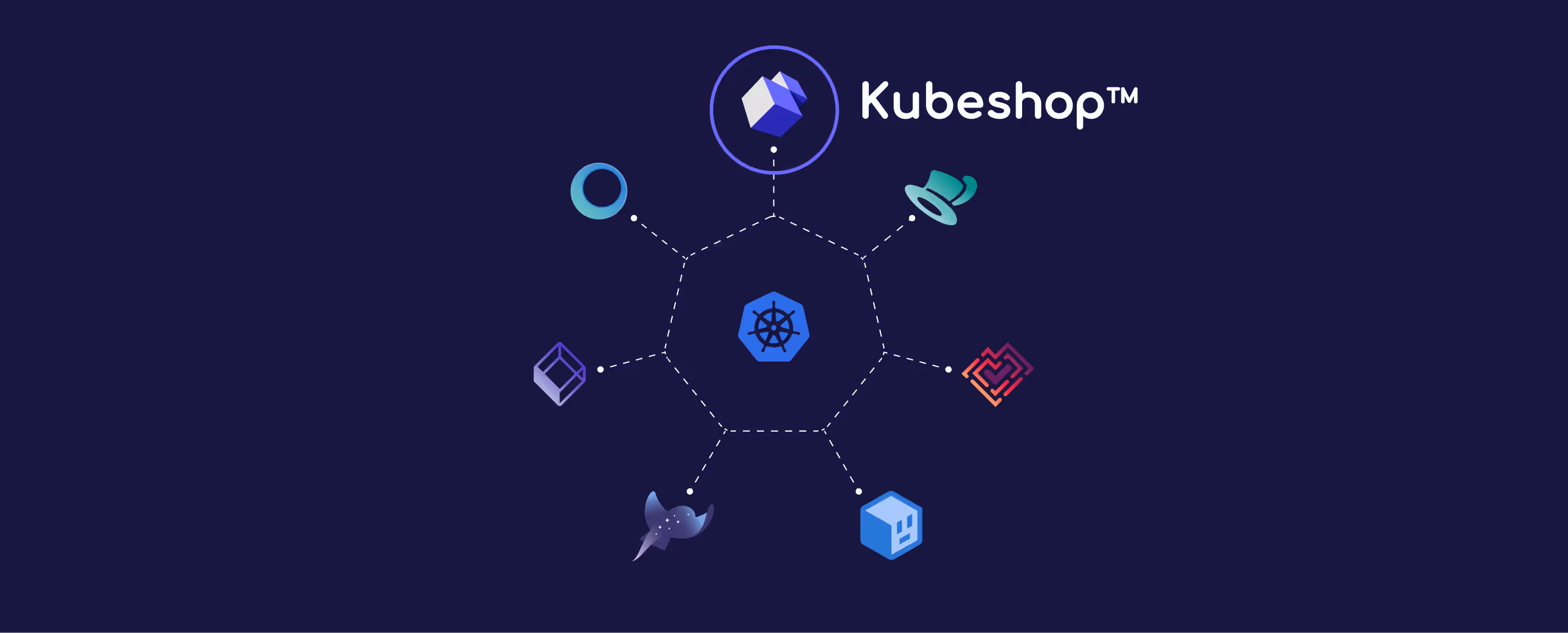
Kubeshop faced a double challenge: creating a distinctive visual identity in a crowded market and building rock-solid, but flexible foundations for its ecosystem of startups — both current and future ones. Kubeshop’s projects needed to have the similar recognizable feel but unique look.
Our role
Firstly, Kubeshop needed a visual identity that reflected its innovative and collaborative approach. The design needed to stand out in the Kubernetes and cloud-native world, be visually appealing, and function well. The brand needed to reflect the values of being open, transparent, and driven by the community, as well as highlight what made Kubeshop unique compared to its competitors.
Secondly, we needed to create a flexible and detailed foundation for all Kubeshop projects. Every project had its own unique features, but they all needed to be clearly linked to the Kubeshop brand. To do that, we needed a simple but detailed design ecosystem: scalable visuals, brand characters, illustrations, and web components. All distinct, but connected.
— Polybox marketing research

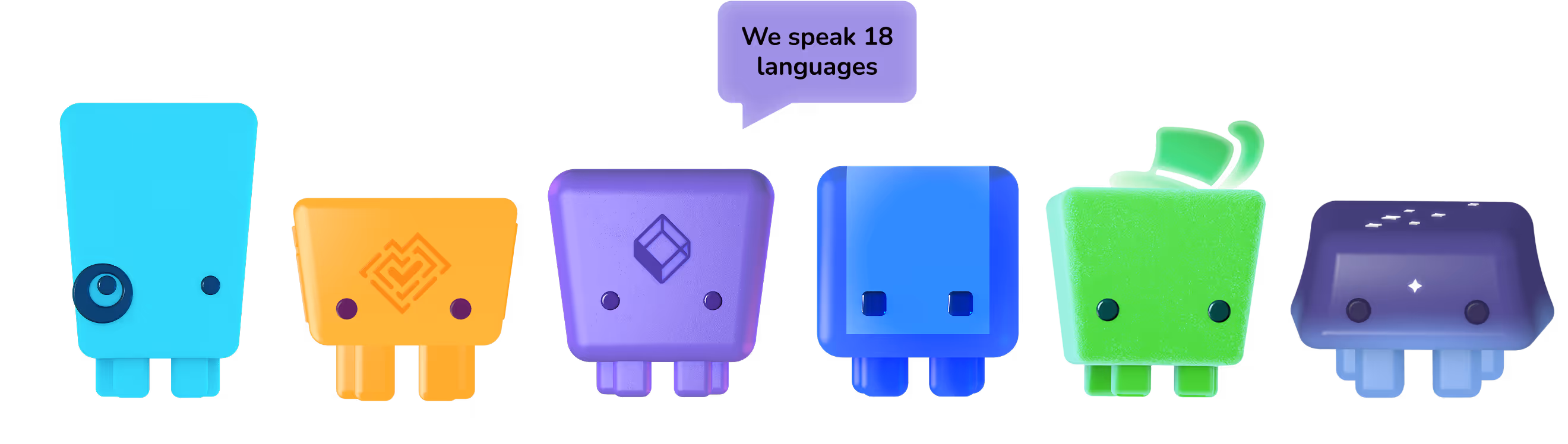
Kubeshop illustrations


%201.avif)
For the Kubeshop brand, we created unique universes for each of its sub-brands. This helped humanize the technical products and make them easier to differentiate. The worlds represent the essence of each sub-brand and hint at the products they offer.
We built detailed 3D worlds with a distinctive aesthetic that allows us to create unique visuals. These illustrations work well in all media, including digital media like websites and presentations as well as printed materials.
master Logo re-imagined
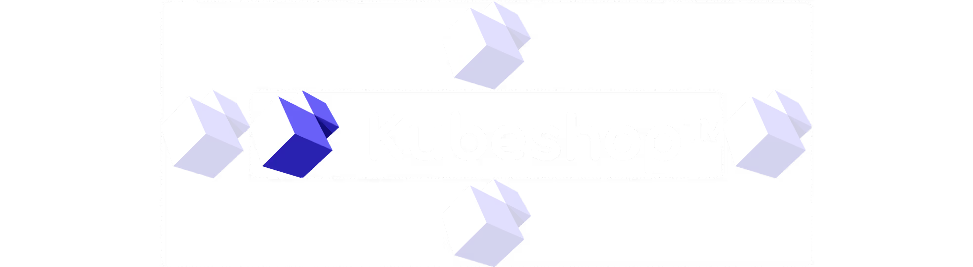
Kubeshop already had the main logo icon, but we needed to complete branding and refine existing assets. We have redesigned the master logo and created a scalable brand ecosystem that became the foundation for a unified yet distinct sub-brand family. We used an abstract cube-derived symbol, a deliberate nod to Kubernetes' modular architecture.
The typeface Nunito added softness and approachability to branding, and we have extended it as a typographic solution for all sub-brands.
.avif)

- ManagerValeria KozlovaDonata VolkovaCamilla Davis
- Technical DesignerElizaveta VakhrameevaAleksandra Kalinicheva
- Web DesignersElizaveta VakhrameewaYana KutlushinaSvetlana KalmykovaAlina SultanovaJulia MolochaevaDenis Gurkov
- DesignerElizaveta Vakhrameeva
- 3D DesignerElizaveta Vakhrameeva