Monokle

About the client
Full-cycle design development for a K8’s integrated development environment
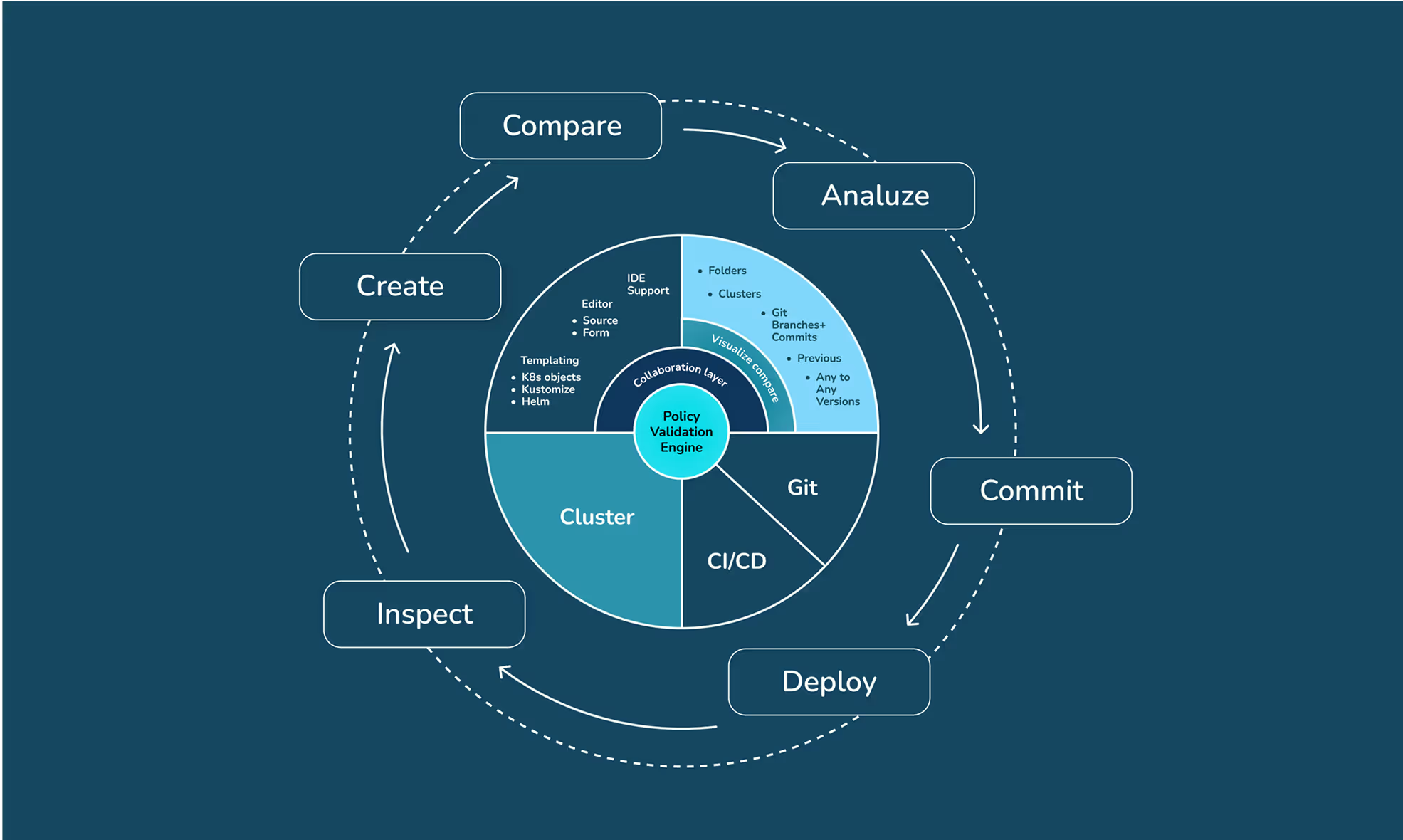
Monokle is a toolset for making and maintaining top-notch Kubernetes setups throughout the whole app life cycle. It helps teams go through the whole Kubernetes deployment process, from dev to prod.
- Timeline:1 year
- Services:Branding
Web design
UX/UI design
Web development
Illustrations - Website:monokle.io

Problem Statement

Monocle's visual identity had to strike a delicate balance - it had to match Kubeshop's main brand, but also be unique and memorable. We wanted it to be like another family member, sharing some of the same traits but having its own personality.
For an open-source project, every design decision we made was super important because we needed the branding to be trustworthy. We wanted people to trust Monokle and feel like they were part of something bigger. The branding had to reflect the collaborative spirit of the community.

Our role
We had to translate Kubeshop's image into a sub-brand identity that felt both connected and independent. We wanted to honor Monocle's purpose - a visual editor for Kubernetes YAML manifests - while ensuring it resonated with developers who live in the trenches of efficiency and precision.
We decided to solve this problem by intentional evolution: preserving Kubeshop typographic foundations and structural rhythms, and then layering Monocle unique personality - a teal-accented palette (symbolizing analytical clarity) and a monocle-shaped logo that shows its role as a visual inspector for complex code.
— Polybox marketing research
illustrations


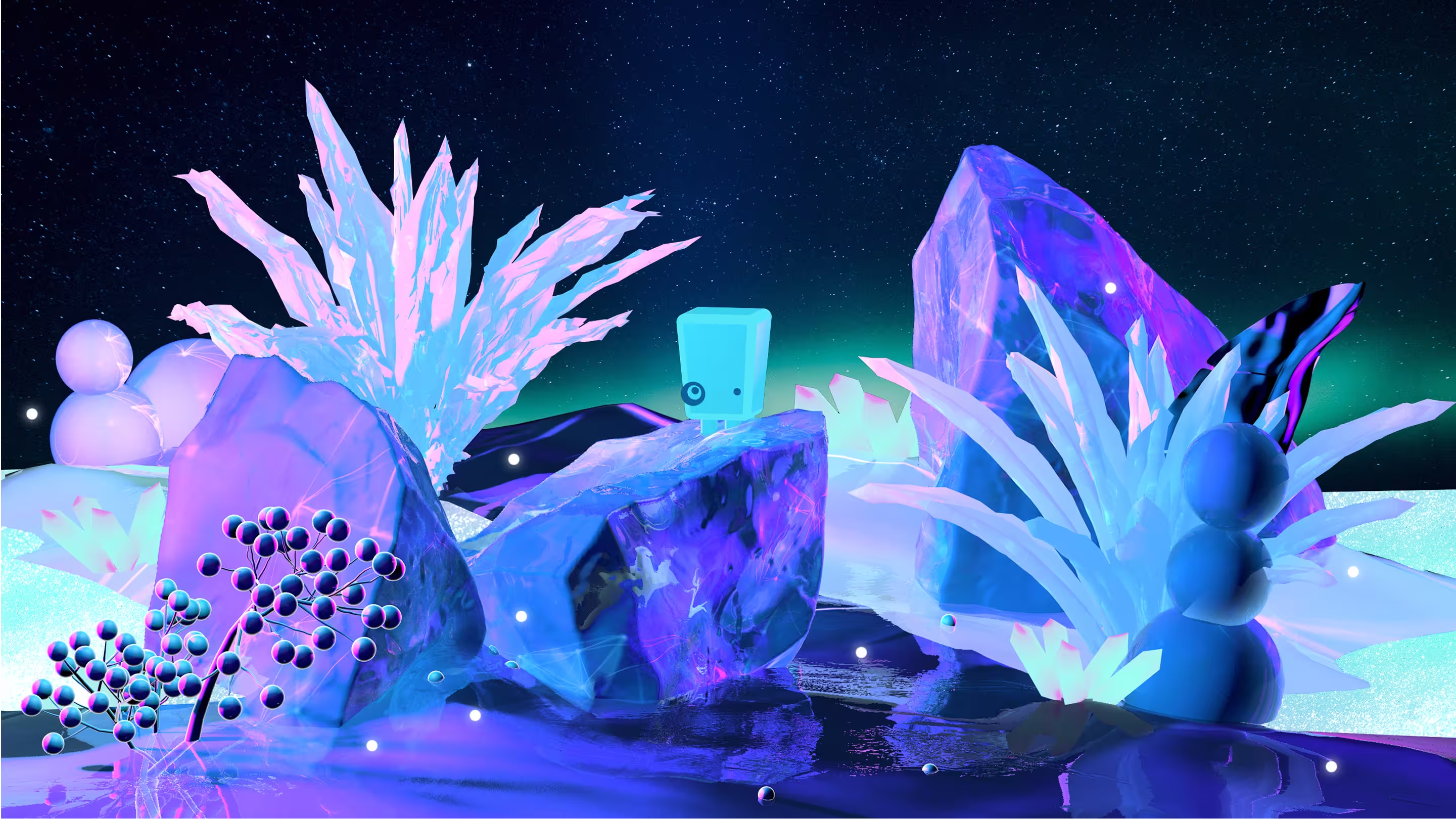
The brand's character, Monocle, was created to be the perfect embodiment of their promise: clarity in complexity. We gave it a teal and ice color scheme so that it would stand out in the Kubeshop ecosystem. Its monocle, which echoes the logo, is a tool that turns chaos into order and helps to make Kubernetes YAML manifests clearer.
Monocle's frozen 3D world is completely different from what you might expect. Ice, which is normally cold and stiff, actually represents how Monocle can help users see things more clearly. The soft, organic shapes and plants that break through the ice demonstrate that he is not just a rigid tool but also a tool that encourages growth.
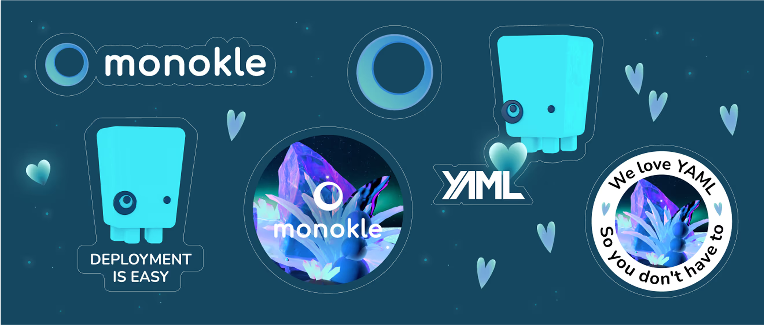
This universe became Monocle's unifying visual language. We used the mascot and illustrated ecosystem everywhere - online (web, presentations) and offline (stickers, swag) - turning a functional tool into an iconic symbol.

Design Rationale
The Monocle brand was a bit tricky for us. We had to find the right balance between being clear and approachable, but also making it friendly and interesting. We didn't want people to think of the tech tool as boring – we wanted it to be bright and full of life.

— Elizaveta Vakhrameeva
Brand designer

Logo anatomy

We rooted Monocle's logo into the visual identity of Kubeshop for easy recognition, but we reimagined it as a monocle itself. It's a symbol of focus and accuracy. The logo is paired with Nunito type, which balances technical precision with approachability thanks to those soft curves.
.avif)
The Monocle Design System
%201%20(1).avif)
We built a Figma design system to make sure Monocle stays true to its identity even with all the product changes. The system protects the brand's look while still allowing for innovation by being modular and reusable.
By putting all the color logic, typography hierarchy, and interactive elements in one place, we made sure every part of the design is clear and consistent.
.avif)
- ManagerValeria KozlovaDonata Volkova
- Technical DesignerElizaveta VakhrameevaAleksandra Kalinicheva
- Web DesignersElizaveta VakhrameevaYana KutlushinaSvetlana KalmykovaAlina SultanovaJulia MolochaevaDenis Gurkov
- DesignerElizaveta Vakhrameeva
- 3D DesignerElizaveta Vakhrameeva