Prison Visitation Fund
.avif)
About the client
Finding a voice and a face for a non-profit organization
Prison Visitation Fund is a New York charitable organization founded in 2020. It is dedicated to helping families stay connected with their incarcerated loved ones by providing financial assistance, logistical support, and coordination for prison visits.
- Timeline:2 weeks
- Services:Branding
- Website:prisonvisitationfund.org
Problem Statement

Prison Visitation Fund has been successfully providing help for separated family members and has already helped more than 150 people visit their loved ones. However, to expand its impact, the organization still needed to reach a broader audience and secure additional funding. Research showed that family visits play a vital role in social well-being and can reduce recidivism by up to 50%.
Having a loved one in prison is emotionally challenging but what’s even harder is going through it in silence, without ever asking for help. One of the main obstacles the Prison Visitation Fund faced was the reluctance and feelings of shame among potential applicants. This issue needed to be addressed through thoughtful and empathetic branding.
Our role
Building a strong brand is all about capturing what your organization is really about — its vision, mission, and story — and sharing that through your tone, the words you use, your images and how you connect with people.
When working with Prison Visitation Fund our goal was to create a clear identity that would become a symbol of support, inspiring donors and volunteers to be proud of their association with them. We wanted it to be respectful, avoiding the use of stigmatizing words or images, and to show appreciation for the target audience.
93% of nonprofits believe that creating a strong brand identity can increase donor engagement, and 74% say a strong brand identity leads to an increase in recurring donations. — Mallory Erickson
Consistent, strong branding can increase revenue by up to 23%. — Influencer Marketing Hub
Five in six nonprofits have worked with professional designers and marketing professionals to enhance their brand. — NonProfit PRO
— Polybox marketing research
Challenges

Creating branding for a nonprofit organization can be a delicate task.
Firstly, it involves addressing a very serious issue — one that impacts the well-being of our entire society —because the benefits of increased visitation go far beyond the personal level. The branding needs to be restrained, yet still relatable and friendly.
Secondly, it’s not just about designing a logo; it’s about finding a voice and creating an entire world where every element works together to evoke feelings of warmth and hope.
Design Rationale
There are invisible threads that connect people, just like the visible threads in branding connect the content. Classic paging and Antiqua typefaces create a clean layout and a relaxed atmosphere. Our main goal is to show that any barriers can be broken down if you want to provide support for those in need. We focus on photographs showing real human emotions and creating feelings of comfort.

— Arina Belyantseva
Brand designer
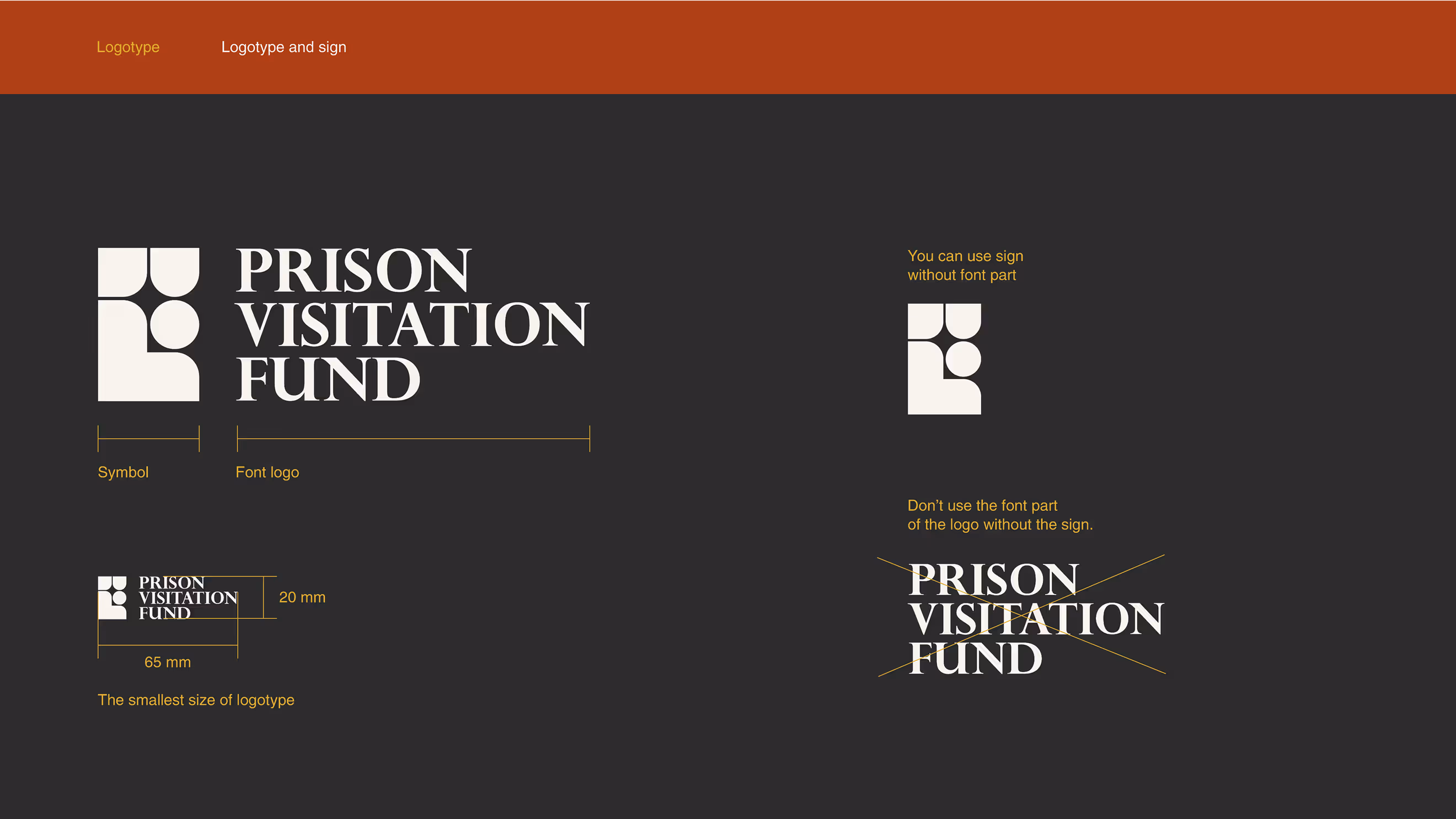
Logo anatomy
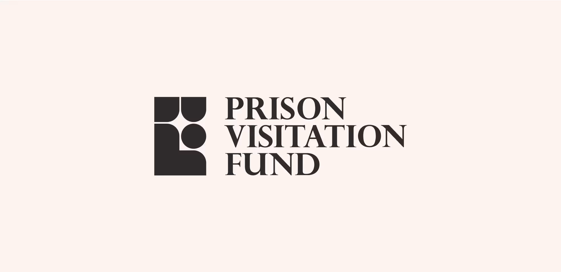
In the logo, we used rounded, matching shapes combined into stylized human figures to emphasize the idea that the fund maintains connections between people.
Rounded shapes in logo design, like circles and curves, generally evoke feelings of friendship, community, and harmony. They are often associated with safety and a sense of belonging.

Problem Statement
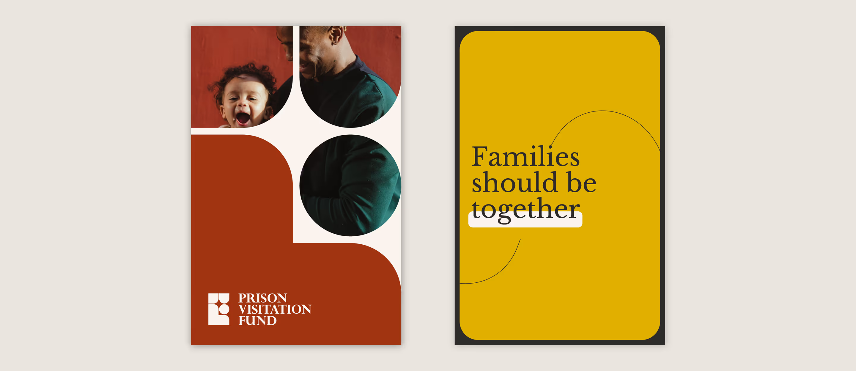
We carefully picked photos with warm colors and stories that really support the message behind the Prison Visitation Fund. Each one wasn’t just chosen because it looked nice, but because of the feeling it gives: hope, connection, and real human emotion.
We included things like hands holding, to represent those long-awaited reunions, and smiles with soft sunlight on faces to bring out a sense of peace.
There’s also a bit of a cozy, retro vibe in some of them, something that feels familiar and comforting, like family memories and the importance of being together.
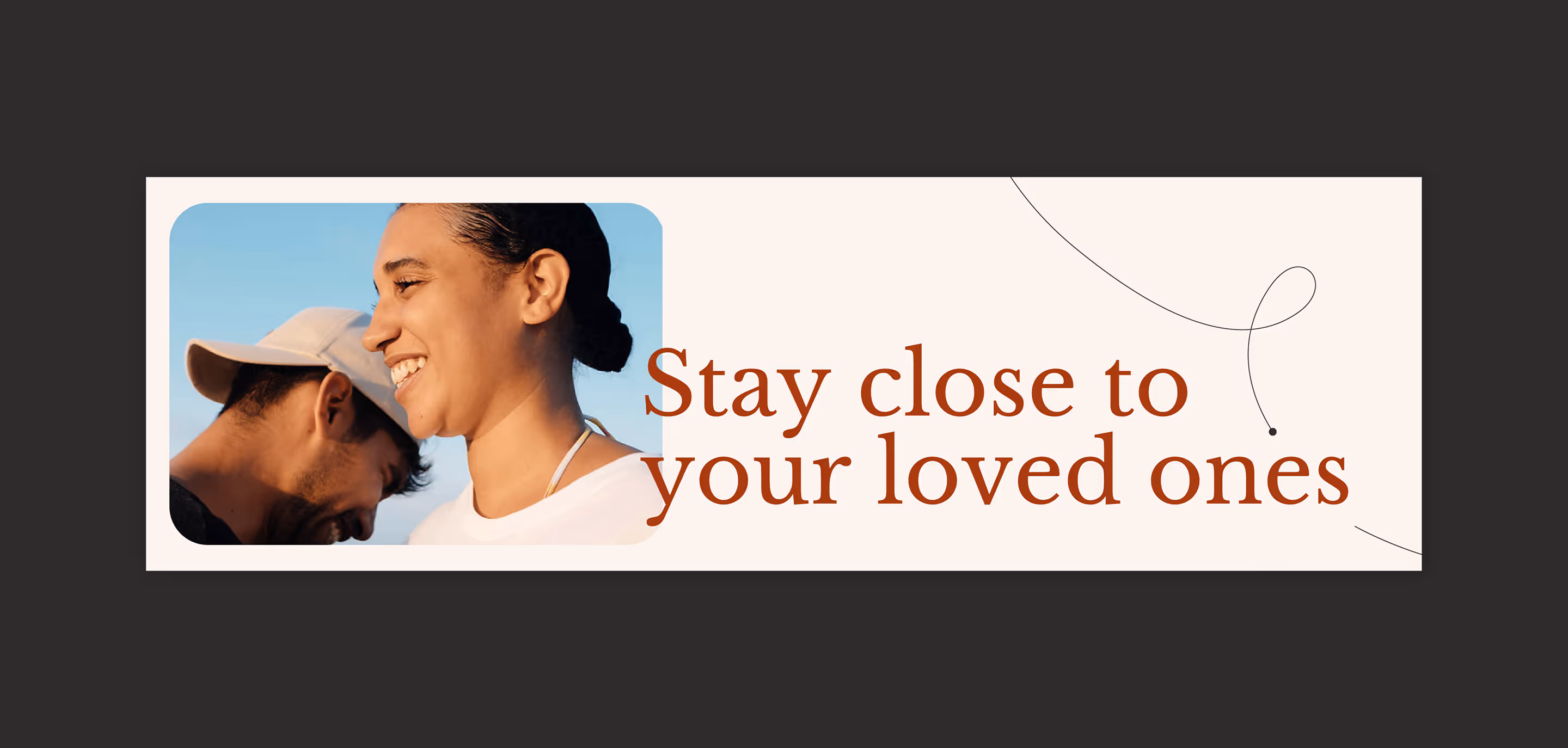
Color palette
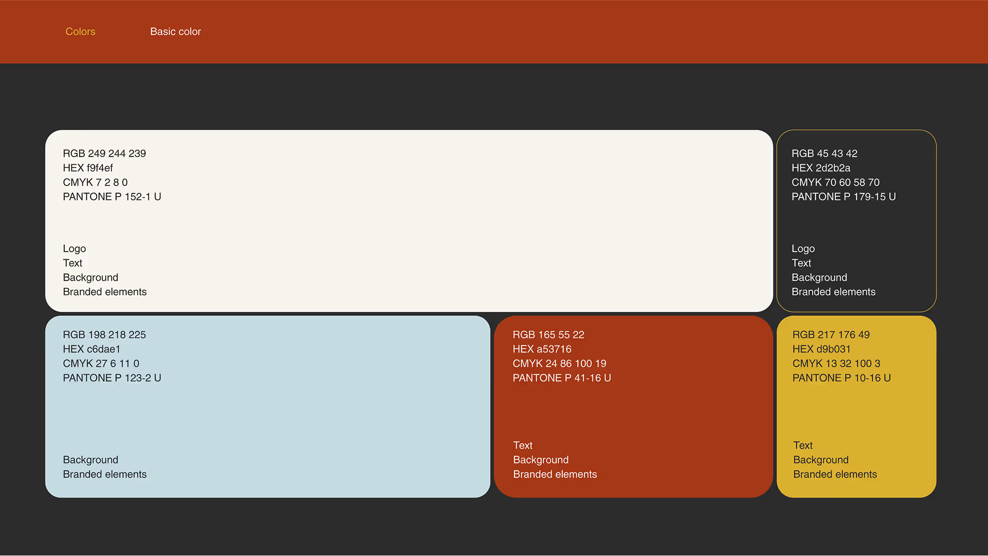

We love muted colors! You can absolutely make a bold statement with shades like these. This particular color story is closely tied to the photo content: sky blue, warm terracotta, and sunny ochre all complement the main calm palette.
The colors work beautifully together and can be mixed and matched in any combination.
interface
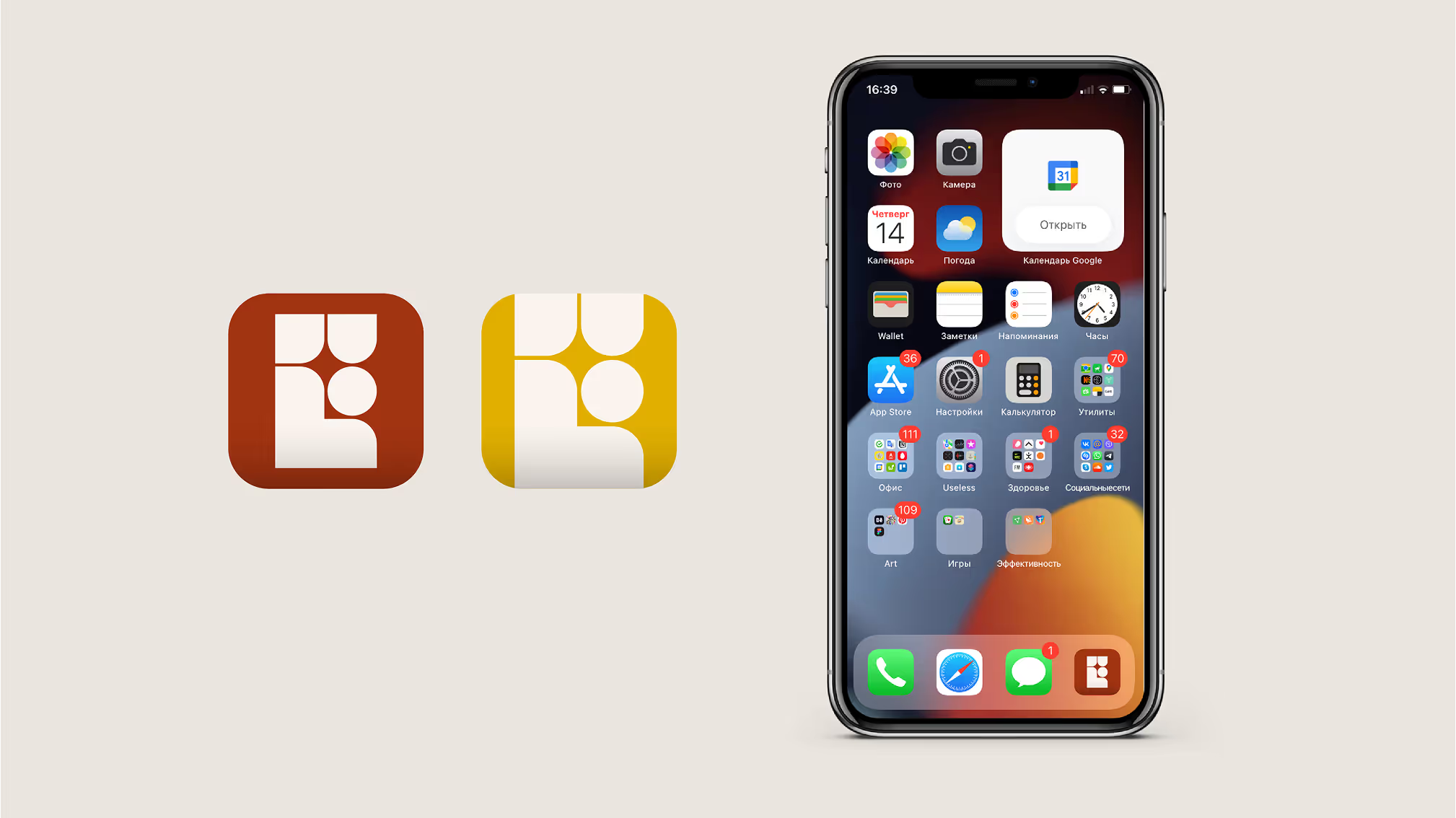
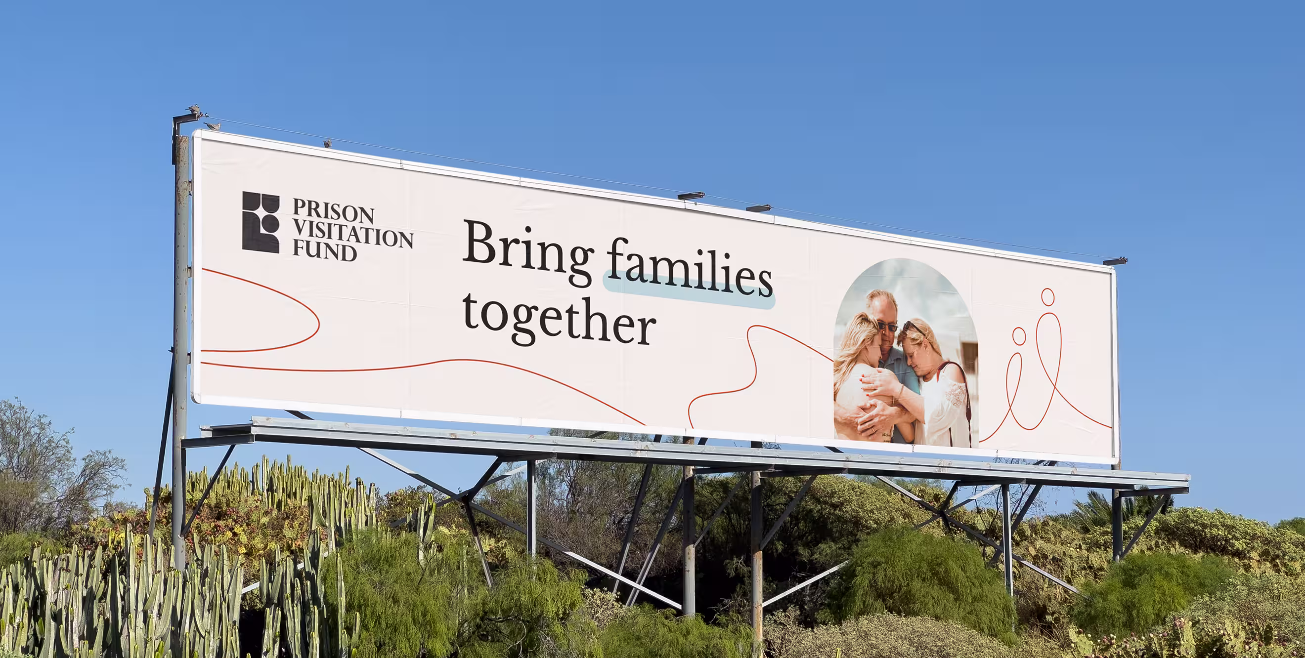
The lines in the design create a visual metaphor for human connection, while also helping to unify the content. Some elements have rounded corners, which adds a nice variety of shapes and gives the overall design a sense of comfort and familiarity.
It's all about creating something that feels warm and approachable, just like the message behind the brand.
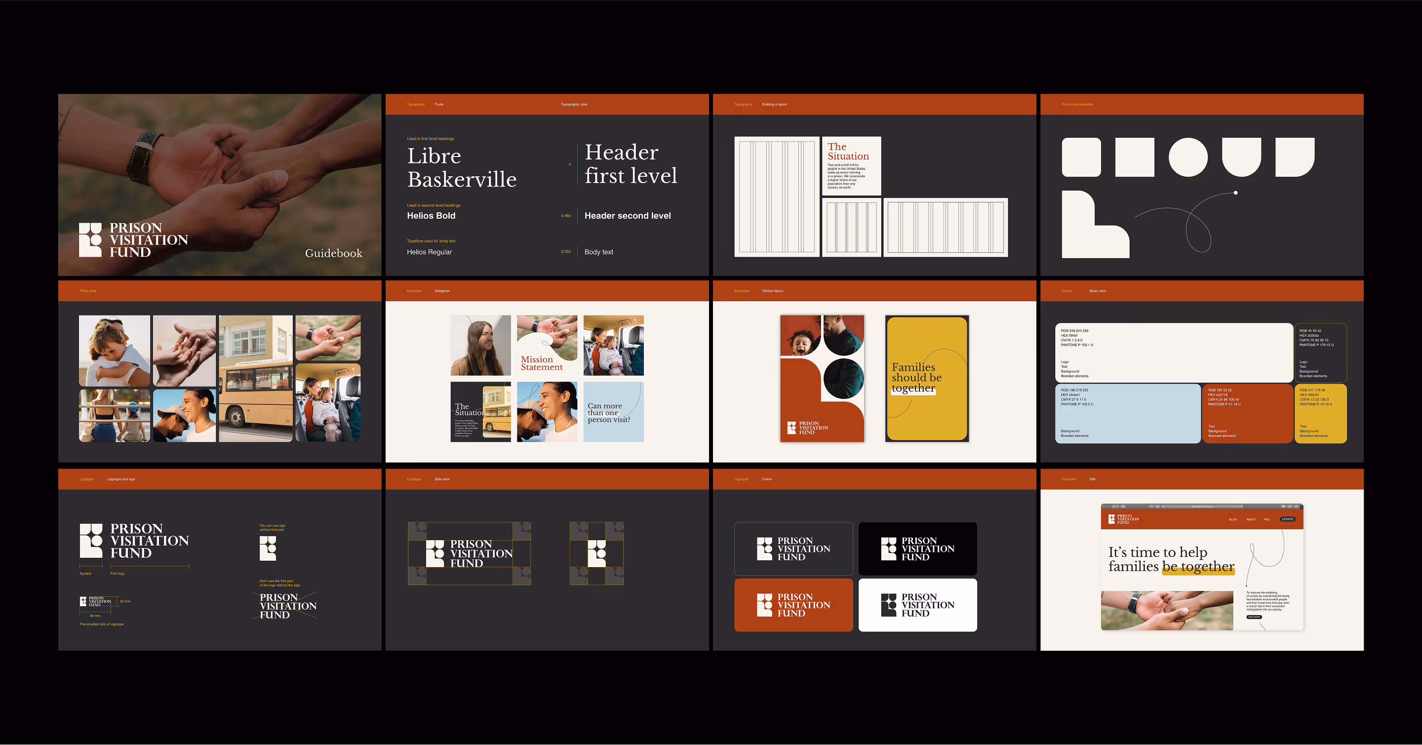
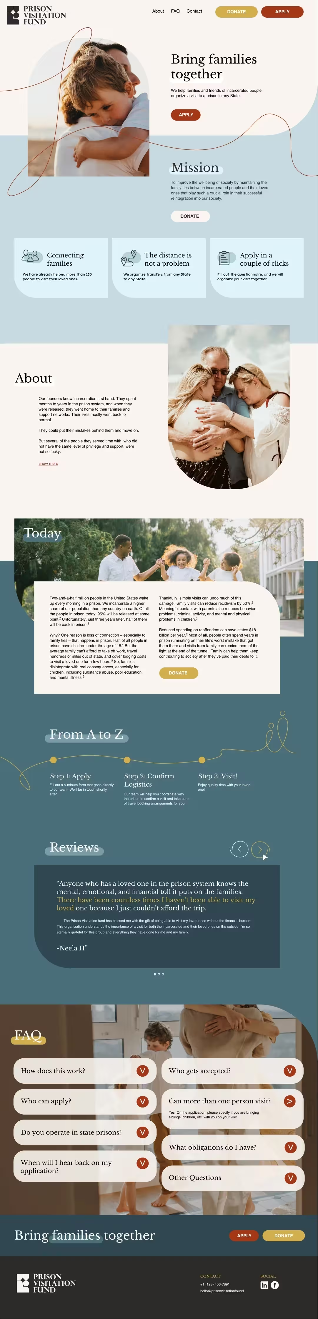
For the Prison Visitation Fund, we developed a full visual identity — including their logo, font, color palette, and overall design direction.
We delivered:
- A brand guidebook
- Website design
- A flexible design system for future use
- ManagerValeria Kozlova
- Technical DesignerElizaveta Vakhrameeva
- DesignerArina Belyantseva