Projector
About the client
Innovative branding for an online project management school
Projector is an educational project that helps people become skilled managers of online schools. It was started by Julia Ostanina in 2020, and it offers practical and detailed courses on top jobs in the fast-growing world of digital education.
- Timeline:2 weeks
- Services:Branding

Problem Statement
.avif)
The online education market is crowded, so it's harder than ever to stand out. Projector needed a strong, unique and forward-thinking brand identity to attract new students.
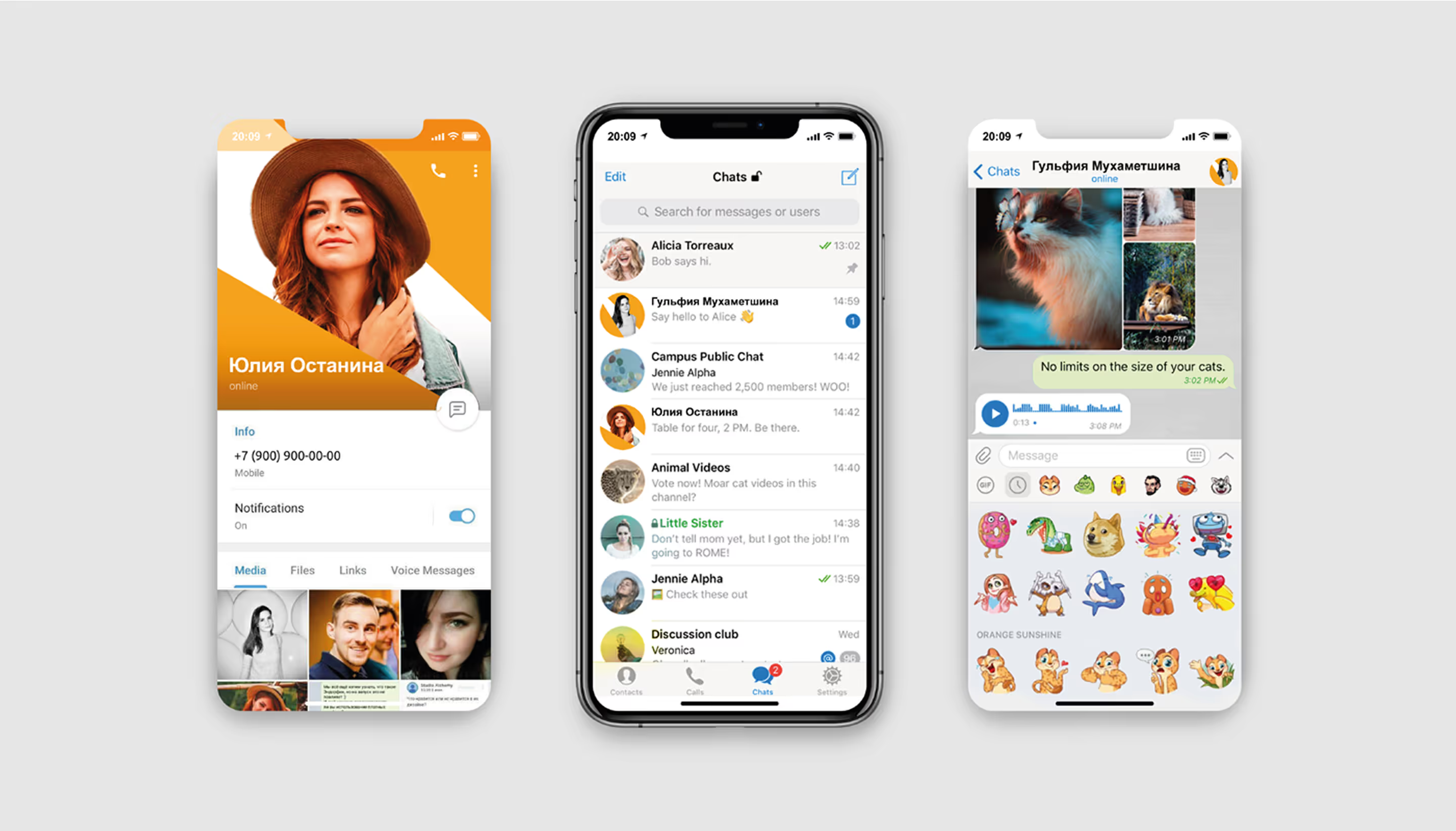
The new look has to work across all aspects - the workbooks, presentations, social media and physical merchandise - to create a consistent image. Since students spend a lot of time on the platform, it's important to make their experience enjoyable and engaging.
Our role
What do you feel when you look at Projector? Having deep conversations with our clients is one of the most important parts of our job. After all, every brand is rooted in psychology.
We crafted a visual identity that reflects what Projector stands for: unlimited possibilities, teamwork, support, and strength.
Firstly, we created a distinctive logo that showcases the brand’s strong, charismatic vibe.
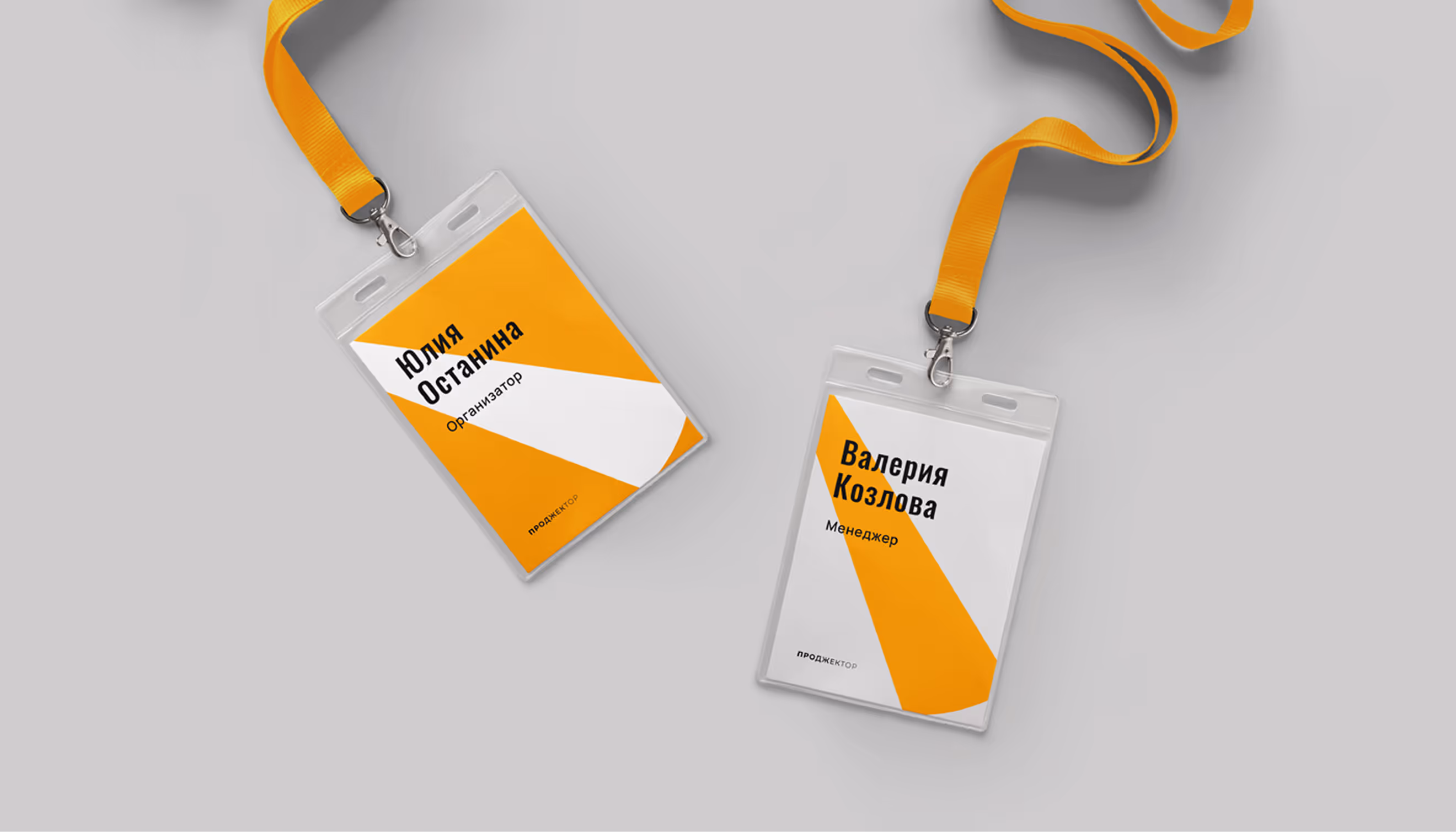
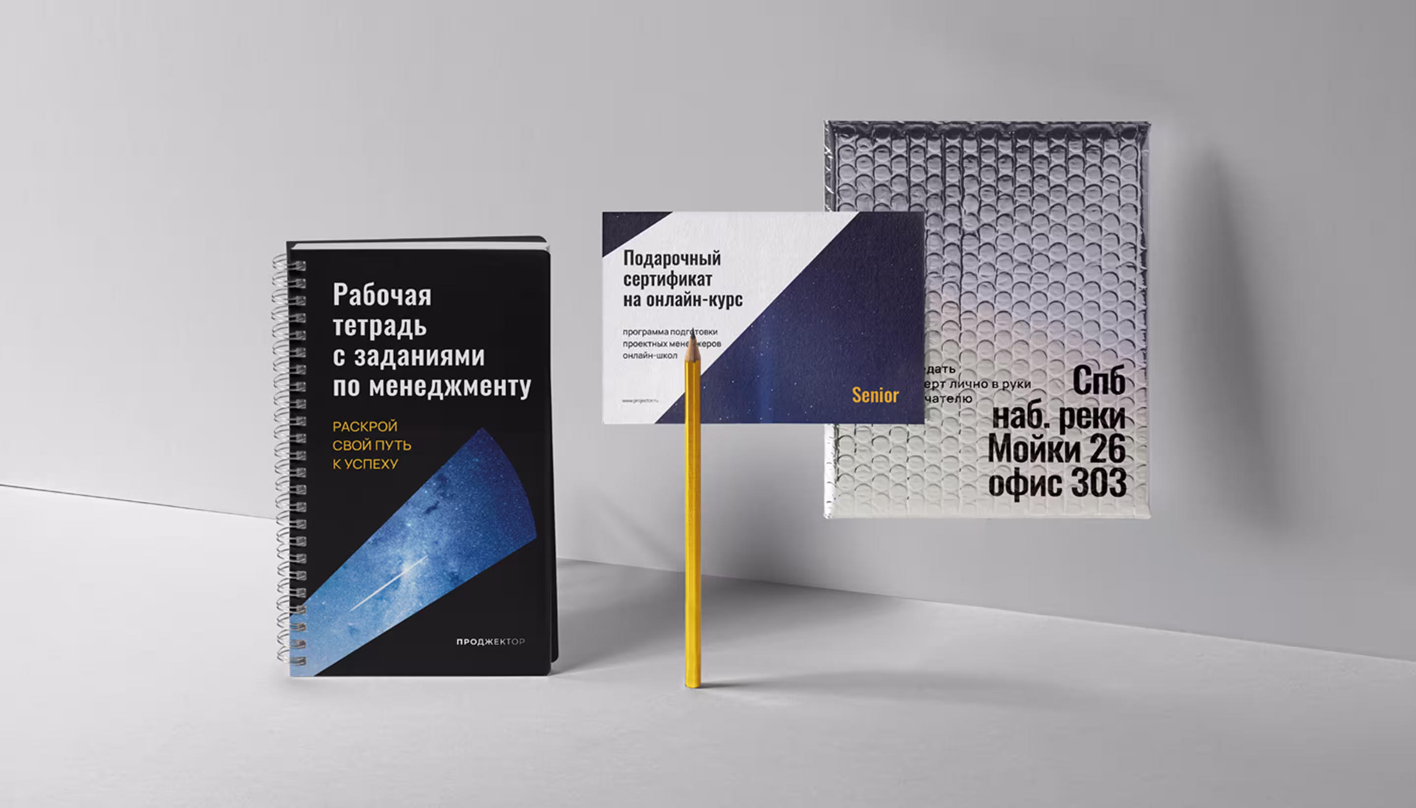
Secondly, we developed flexible elements such as color palettes, fonts, patterns, and graphics that work seamlessly across websites, social media, presentations and physical products like caps, business cards, and pencils.
Learners are more likely to trust and enroll in courses that are professionally branded, as this showcases your knowledge and expertise in a polished manner. Courses without branding can seem less trustworthy and less professional.
— Polybox marketing research
Design Rationale
When we were working on the Projector brand, we thought of it as a character – a bright, strong and charismatic person who could change the world. It's always moving forward with a glow and passion inside. We wanted to bring that energy into our design by combining clear, organized elements with a bit of creativity.
— Julia Molochaeva
Brand designer
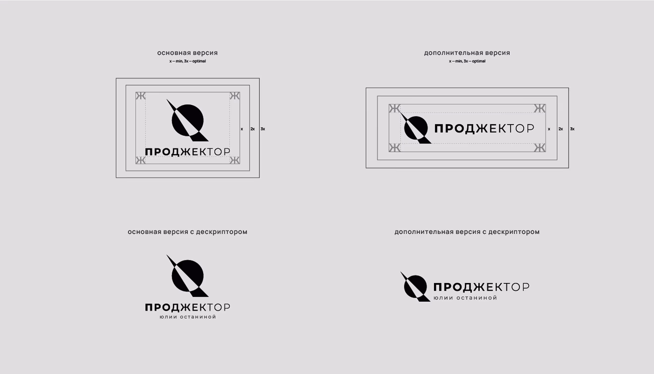
Logo anatomy
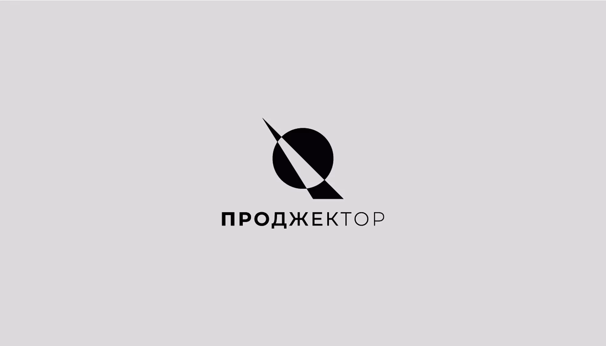
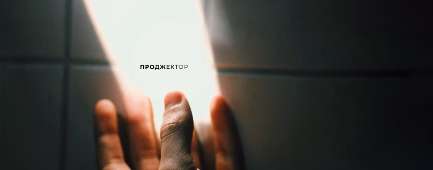
The logo is minimalist, featuring an abstract projector that emits a focused beam of light. Notice how the letters themselves seem to be illuminated by this beam — their thickness gradually thins out toward the end of the word, creating a dynamic visual effect.
This design perfectly captures the essence of the brand. At the same time, the components work independently: for example, the wordmark can stand alone on a t-shirt, or just the projector icon can be used as a pin.
Diving into the details
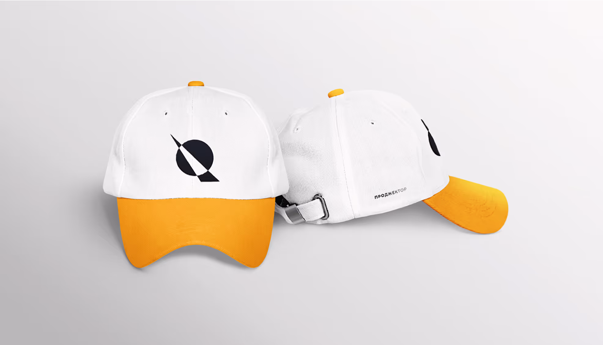
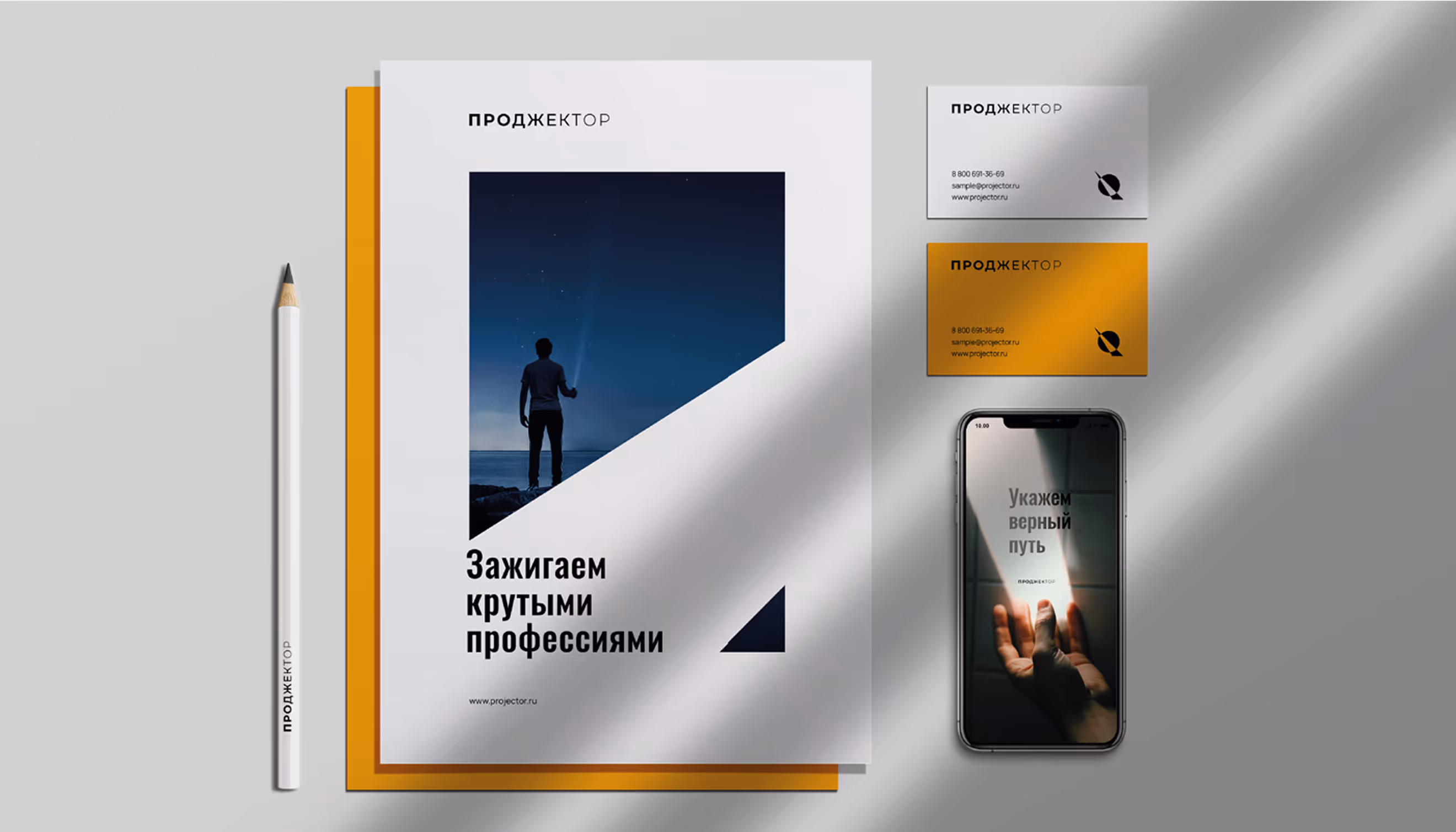
We showcased how branding elements can be used on caps, notebooks, and business cards. See how the beam of the logo and its geometric shape slides right into social media covers, posters, and other materials?
This light beam instantly boosts brand recognition. The colors mix warmth with a tech vibe - bright, juicy orange popping against clean white and deep black. As for typography, we went with a clean, modern sans serif.
- ManagerValeria Kozlova
- Technical DesignerElizaveta Vakhrameeva
- DesignerJulia Molochaeva