TOLU

About the client
Building a Tanzanian microfinance startup a brand identity as bold as its mission
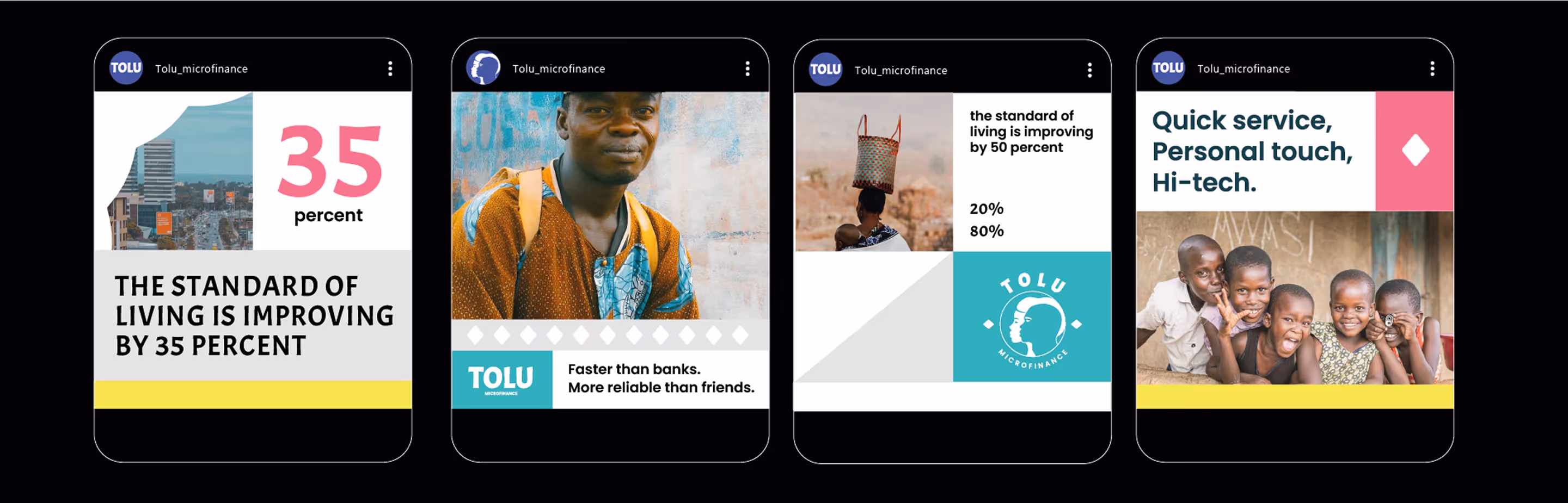
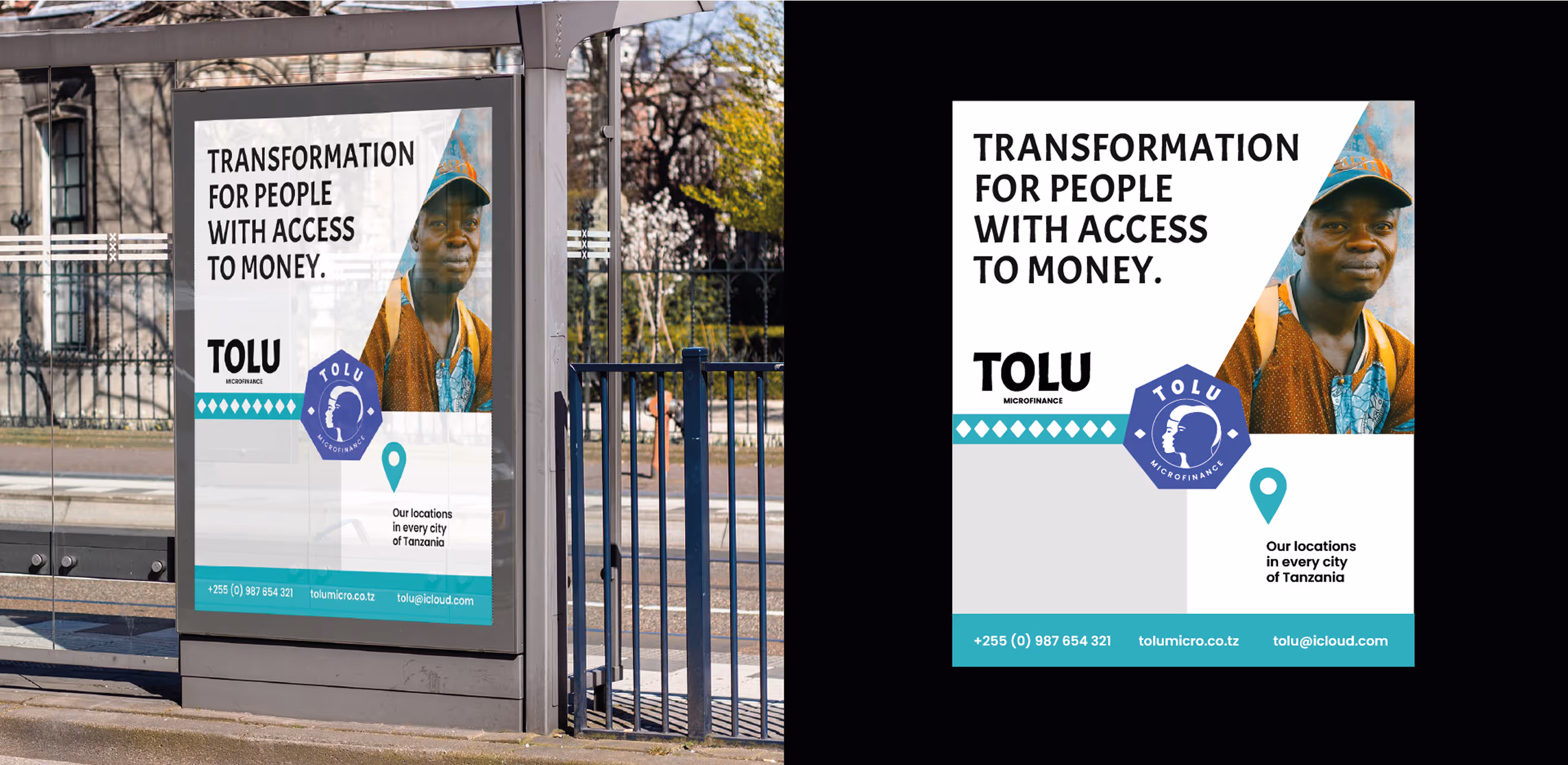
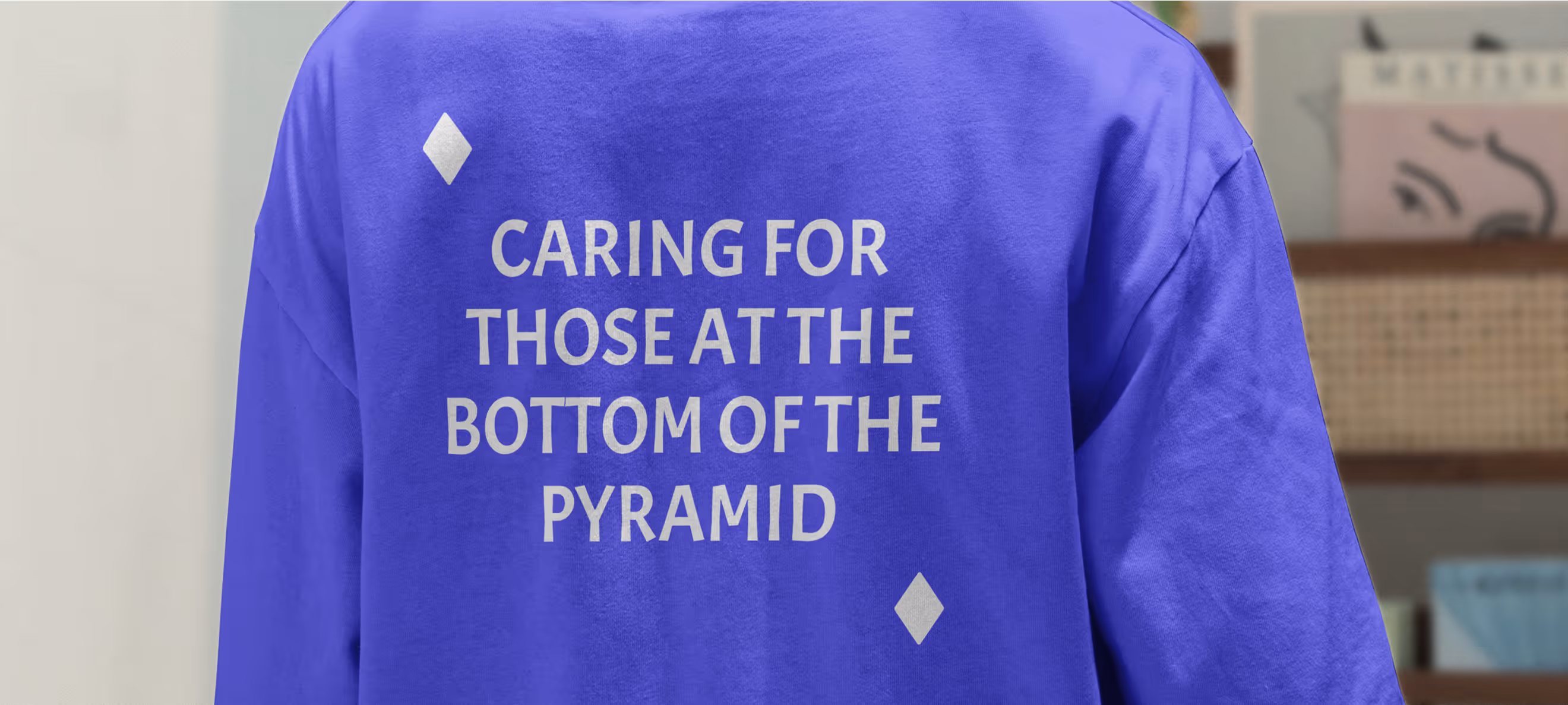
TOLU is a microfinance startup that helps small and medium-sized businesses and individuals in Tanzania.
The company provides financial help and advice to its customers to help them make smart money decisions. Additionally, it offers guidance on running successful businesses, and builds a community of entrepreneurs who share their knowledge with each other.
- Timeline:2 weeks
- Services:BrandingWeb designWeb development
- Website:Tolu.co.tz

Problem Statement

TOLU needed to find its own voice and stand out from the crowd in order to enter the East African market with confidence.
They knew they had to communicate their core values through their branding, like how fast they were, how accessible they were, and how they took a personal approach to each customer to helped them better.
Our role
We needed to find a visual style for TOLU that would reflect its core values and integrate with the unique cultural environment of East Africa. We considered not only the best practices for creating a corporate identity on a global scale, but also the importance of making the brand appealing to local audiences.
We immersed ourselves in Tanzanian culture, exploring local visual concepts that shared common themes such as a focus on community, African pride, and the unique visual code of East Africa. This allowed us to create a style that was both authentic and relevant to the region.
— Polybox marketing research

Design Rationale
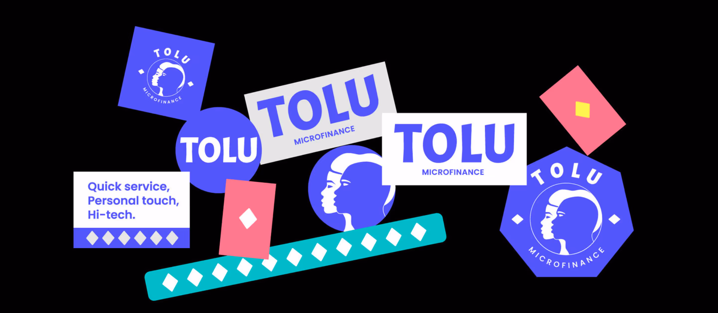
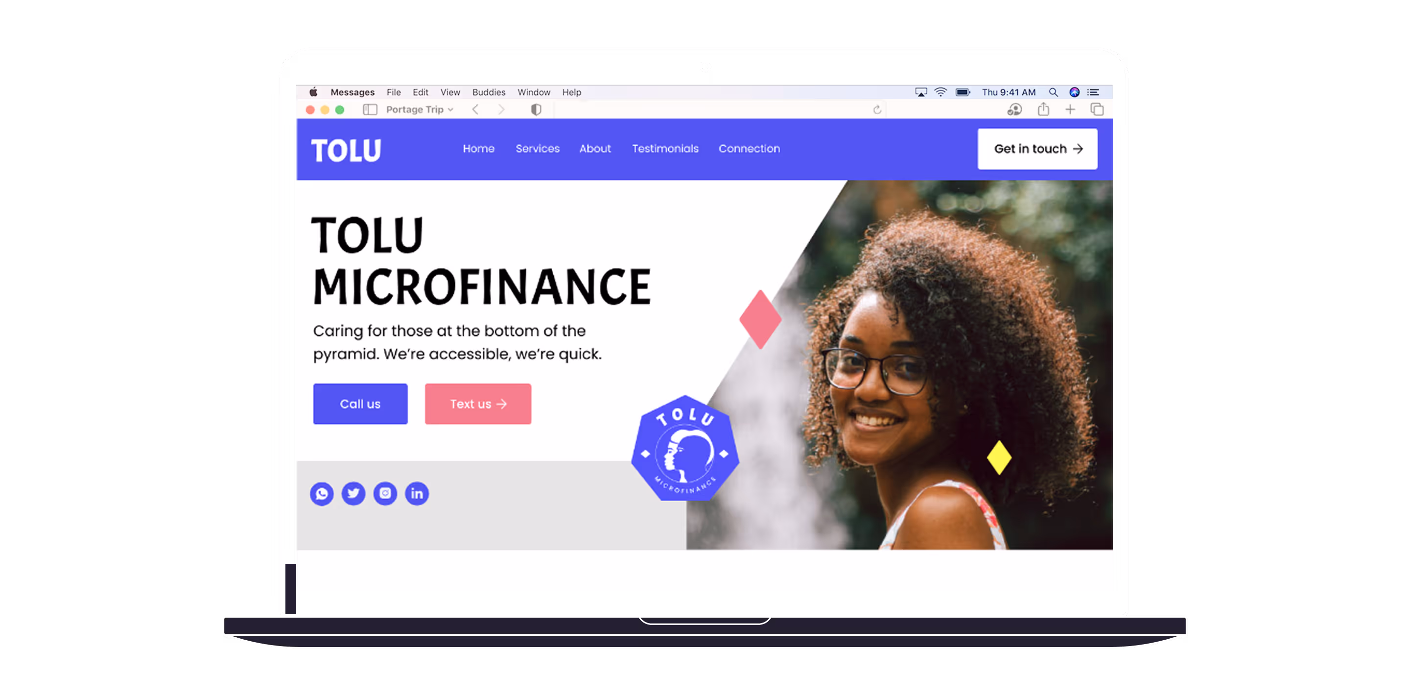
We wanted to show that TOLU stands for personal approach, helping in difficult times, and supporting others. So, we came up with the idea of using a human profile as a visual symbol. When two profiles are facing each other, it means "we're being honest with you". And when they're facing the same way, it means “we share the same goals”.

— Elizaveta Vakhrameeva
Brand designer
Color palette
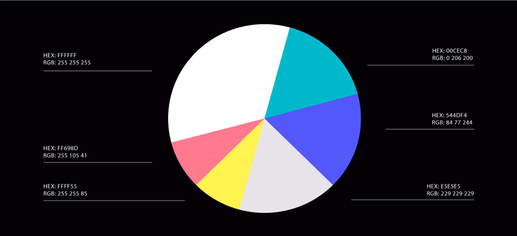

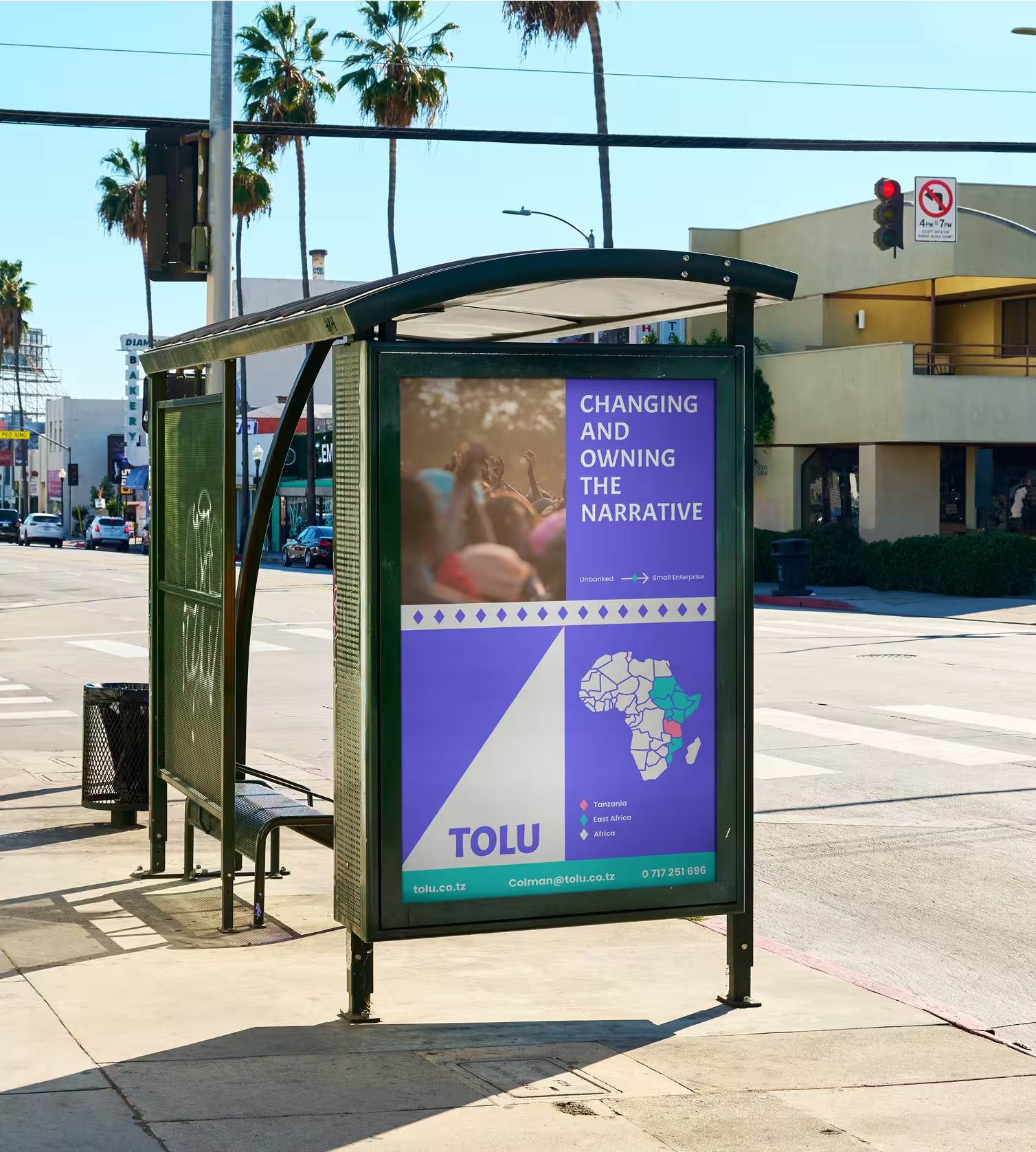
The color palette creates a sense of innovation, thanks to the bright turquoise and indigo, while also looking friendly and accessible, thanks to pale pink and bright yellow. We chose a high contrast between bright and neutral colors, combining cool and warm tones, with the inclusion of neutral colors such as gray and white, to achieve balance.
Geometrical elements
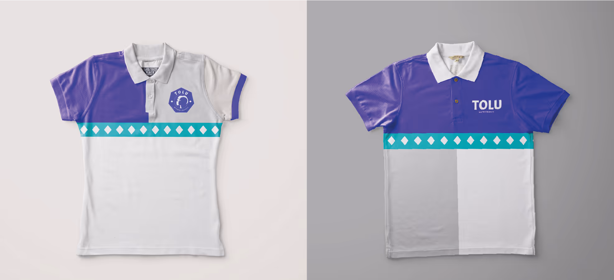
We used a variety of geometric elements in both the logo and the design of the carriers, such as website and advertising. The shapes are not random — they are a subtle reference to East African visual motifs, such as the pattern on kitenge fabric.
Diving into the Typography details
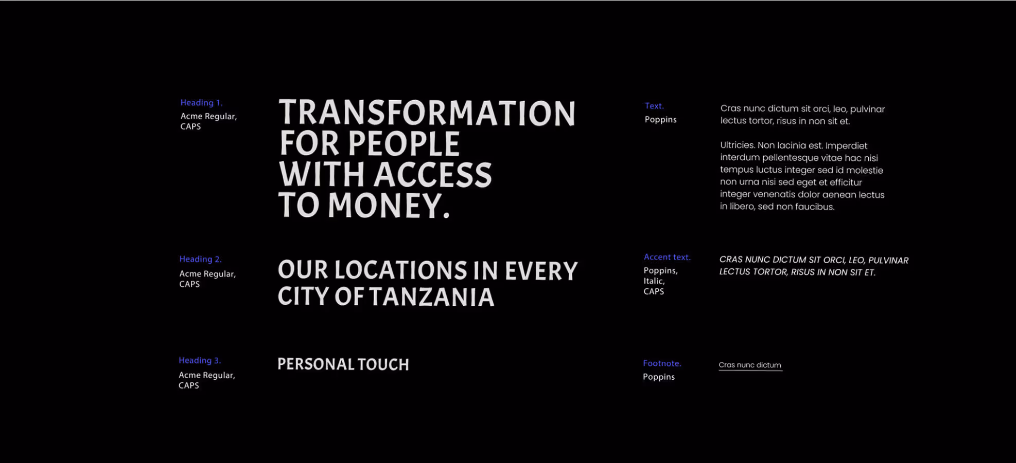

For the TOLU logo, we chose the Acme font for its unique, memorable rhythm. The font's characteristics create a bright, expressive look while conveying friendliness through its rounded forms. Simultaneously, Acme's balanced, clean design projects professionalism, making it ideal for the brand identity.

- ManagerValeria Kozlova
- Technical DesignerElizaveta Vakhrameeva
- DesignerElizaveta Vakhrameeva
- Web DesignerYana KutlushinaAleksandra Kalinicheva